At the end of this Lesson you will be able to:
You can view a finished version of this project by clicking the image below.
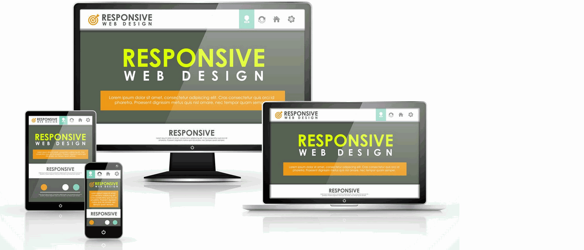
About Responsive Web Design (RWD)
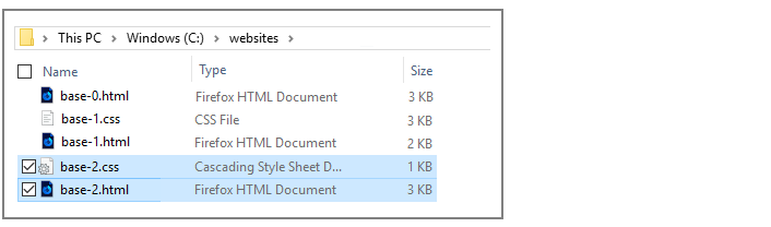
Your two work files: base-2.html and base-2.css
Editing the web page width in your CSS file
Editing the heading styles in your CSS file
Editing the paragraph style in your CSS file
Viewing your responsive web page at different screen sizes
Updating the <head> of your web page
Responsive Web Design (RWD) means using so-called media queries in a CSS file so that the various elements of a web page are displayed appropriately according to the size of the user’s screen.
Typically:
To work with responsive web design in this Lesson, use your text editor to open the following two files from the previous Lesson:
Next, follow these steps:
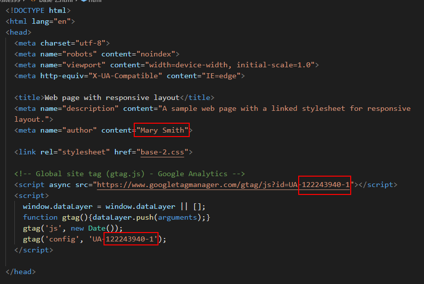
<title>Web page with responsive layout</title>
<meta name="description" content="A sample web page with a linked stylesheet for responsive layout.">
<link rel="stylesheet" href="base-2.css">
You are now ready to work with your new web page (base-2.html) and stylesheet (base-2.css) files.
Note the following line in the <head> of your web page.
<meta name="viewport" content="width=device-width, initial-scale=1.0">
This is required for responsive design to work correctly.
Before continuing, you need to add the following new line to the browser resets section at the top of the base-2.css file:
/* ==== BROWSER RESETS  ==== */
* { padding: 0; margin: 0; border: 0; font-weight: normal; font-size: 16px }

body, html { height: 100% }
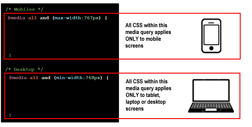
In responsive web design, a breakpoint is a viewport (screen) width at which the CSS styles rules applied to the web page change. Some complex CSS layouts contain several breakpoints. For example, one for small mobile phones, a second for larger phones, a third for tablets, a fourth for desktops and a fifth for wide-screen laptops.
The simplest case is to use a single breakpoint in your CSS. The common such is 768px, the width of an Apple iPad in horizontal mode. In this case:
In a CSS file, these two media queries, as they are called, are written as shown below.
/* Mobiles */
@media all and (max-width:767px) {
  ...
}

/* Desktop */
@media all and (min-width:768px) {
  ...
}
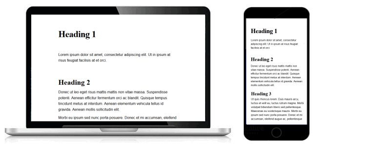
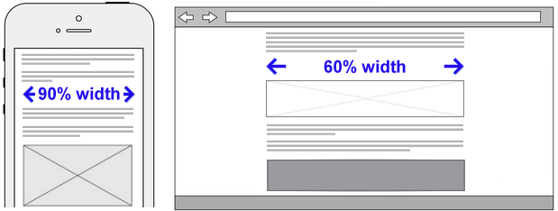
In the previous Lesson, you added an equal amount of ‘white space’ at the left and right edges of the web page. As a result, the content of the web page fills only 60% of the screen.
This is fine for tablet and desktop screens. But it is too narrow for mobiles.
/* ==== PAGE WIDTH  ==== */

/* Mobiles */
@media all and (max-width:767px) {
    body {
       padding-left: 5%;
       padding-right: 5%
    }
}

/* Desktop */
@media all and (min-width:768px) {
    body {
       padding-left: 20%;
       padding-right: 20%
    }
}
For all three heading styles in the base-2.css file, you can see that the margins above and below are set in absolute units of pixels. Let's change those values to percentages as shown below.
/* ==== HEADINGS ==== */

h1 {
    font-family: serif;
    font-weight: bold;
    font-size: 40px;
    letter-spacing: -1px;
}


/* Mobiles */
@media all and (max-width:767px) {
    h1 {
       line-height: 1.3;
       margin-top: 12%;
       margin-bottom: 6%;
   }
}

/* Desktop */
@media all and (min-width:768px) {
    h1 {
       line-height: 1.3;
       margin-top: 12%;
       margin-bottom: 10%;
   }
}


h2 {
   font-family: serif;
   font-weight: bold;
   font-size: 32px;
}


/* Mobiles */
@media all and (max-width:767px) {
   h2 {
      line-height: 1.3;
      margin-top: 12%;
      margin-bottom: 3%;
   }
}

/* Desktop */
@media all and (min-width:768px) {
   h2 {
      line-height: 1.3;
      margin-top: 12%;
      margin-bottom: 2%;
   }
}


h3 {
   font-family: serif;
   font-weight: bold;
   font-size: 28px;
}


/* Mobiles */
@media all and (max-width:767px) {
   h3 {
      line-height: 1.3;
      margin-top: 6%;
      margin-bottom: 1%;
   }
}

/* Desktop */
@media all and (min-width:768px) {
   h3 {
      line-height: 1.3;
      margin-top: 5%;
      margin-bottom: 1%;
   }
}
When finished, save your CSS file.
As with the heading styles, edit the paragraph style to that the bottom margin is expressed as a percentage.
/* ==== PARAGRAPHS ==== */

p {
   font-family: sans-serif;
   font-weight: normal;
   font-size: 16px;
}


/* Mobiles */
@media all and (max-width:767px) {
   p {
      line-height: 1.5;
      margin-bottom: 5%;
   }
}

/* Desktop */
@media all and (min-width:768px) {
   p {
      line-height: 1.6;
      margin-bottom: 2%;
   }
}
When finished, save your CSS file.
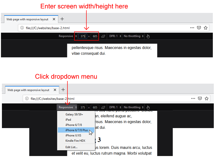
To inspect how your responsive web page displays on various screen sizes, follow the steps below.
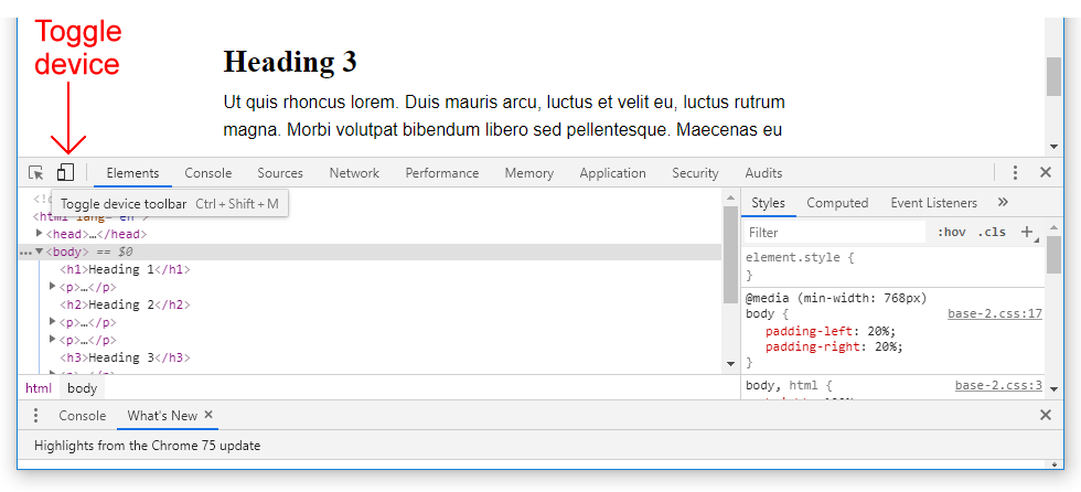
When using the Firefox Developer Edition browser:
 To exit responsive design mode, click the Close (X) icon at the top-right of the window.
When using the Google Chrome browser:
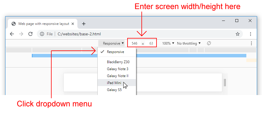
To exit DevTools, click the Close (X) icon at the top-right of the window.
Before you validate your web page and upload it to GitHub, ensure the following details are correct within the <head> of your base-2.html file.
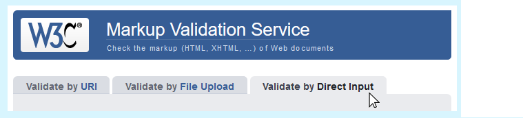
To check the HTML in your web page is correct or valid, use the official W3C Markup Validation Service as follows.
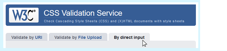
To check your CSS is correct, use the official W3C CSS Validation Service. Follow these steps.
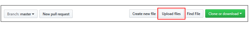
After validating your web page and stylesheet, you are now ready to upload them to your account on GitHub.
Your web page is now published on GitHub at a web address similar to the following, where username is the username you have chosen for your GitHub account:
https://username.github.io/base-2.html
It may take a few minutes for your uploaded files to appear on GitHub.
Return to All Tutorials.
CSS media queries
From W3 Schools
Media queries and responsive web design Responsive web design basics Lesson: Media queries Video: How to use CSS media queries in less than five minutes
From Tutorial Republic
By Pete LePage at the Google Developers Blog
From Webucator Tutorials
By Kevin Powell
Return to Contents.