Introduction
This three-page website for a fictitious travel agency showcases responsive multi-column layouts created with CSS flexbox.
You can display a finished version of this project by clicking the image below.

This three-page website for a fictitious travel agency showcases responsive multi-column layouts created with CSS flexbox.
You can display a finished version of this project by clicking the image below.
At the end of this Tutorial you will be able to:
Portfolio project folders and files
Working with your project files
The structure of your project web pages
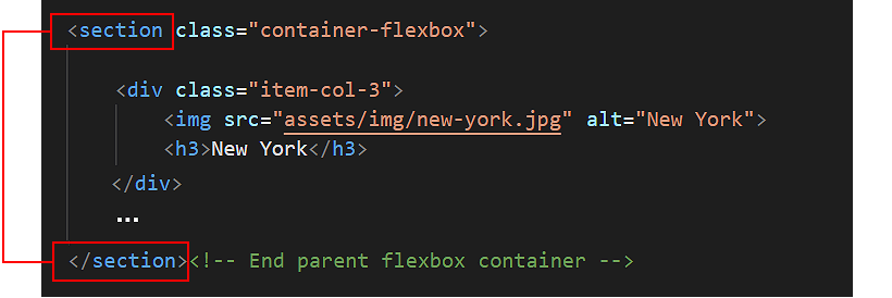
Sub-dividing the web page with the <section> tag
Hero blocks and the <header> tag
Section blocks and class names
Adding padding to the sections
Adding a background colour to the sections
Styling the single-column layouts
Styling the three-column layouts
Styling the four-column layouts
Styling the customer testimonials section
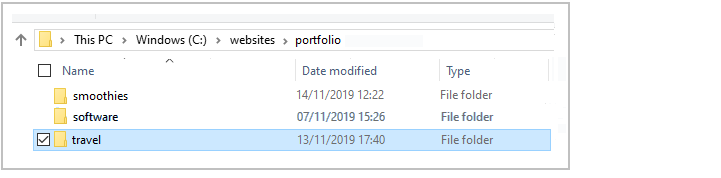
Your first step is to download the files you need for this project.
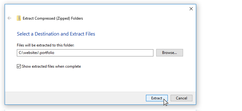
This will create a sub-folder named travel inside your portfolio folder.

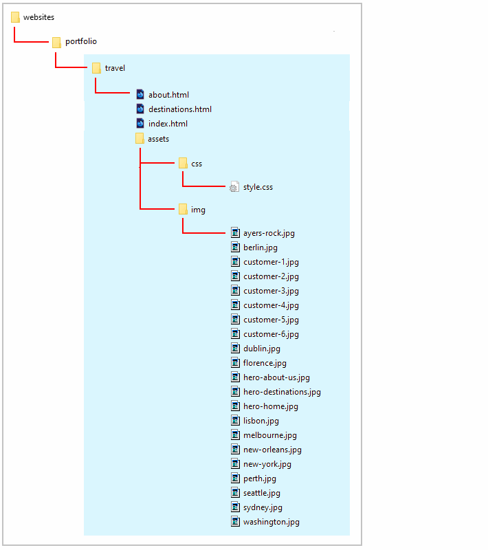
The folders, sub-folders and files for this ‘Travel’ project will be as shown below.
Now you can begin to work with the files you have downloaded.
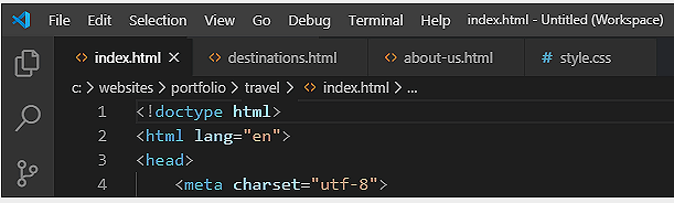
You may wish to close any other files you may have open in VS Code.
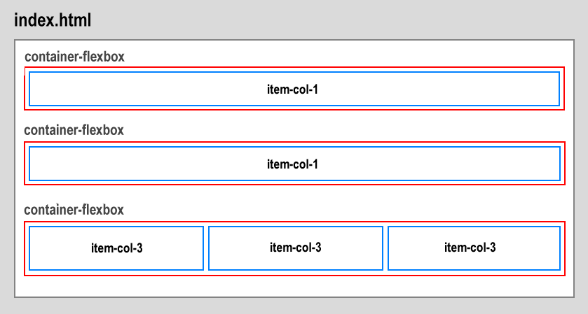
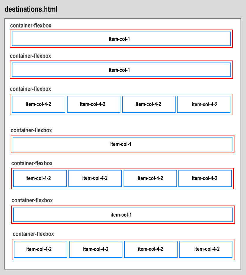
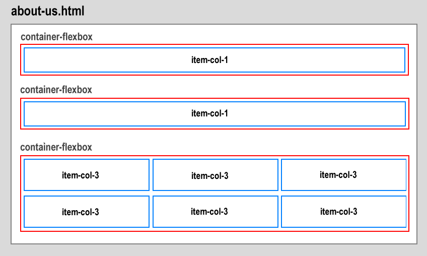
Display the three project web pages in your web browser. They should look as shown below.
Note that all three web pages have a light grey background.

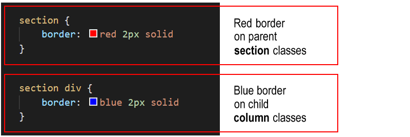
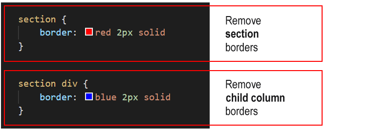
To help you distinguish between the various parent and child elements, the following two styles are added at the bottom of the style.css stylesheet.
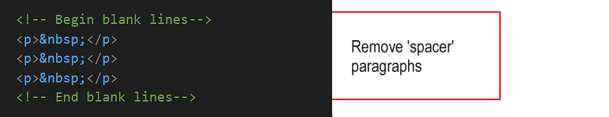
Before and after each parent container is a set of three ‘blank’ or ‘spacer’ paragraphs. These are to help you see where one parent container ends and the next container starts.
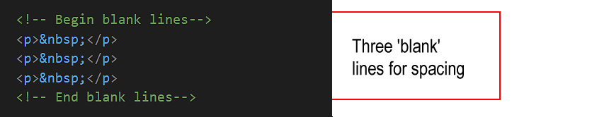
As with the coloured borders, you can remove these blank paragraphs at the end of the project.
As you can see, each of the three web pages is sub-divided into ‘blocks’ of content.
You could use the <div> ... </div> for this purpose.
But a better, more modern HTML5 way is to use another tag pair with the same effect: <section> ... </section>.
sEach web page begins with a hero section that is styled with the <header> ... </header> tag pair.
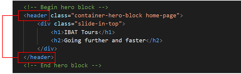
This is similar to the <div> ... </div> tag pair, but is the preferred HTML5 way of identifying the first, introductory content block of a webpage.
Under the ‘hero’ section (styled with the container-hero-block class), the basic structure of the three web pages is as follows.
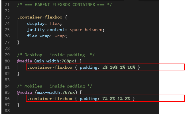
Follow these steps to add spacing around the four inside edges (top, right, bottom and left) of the parent flexbox containers.
In your web browser, view the web page on desktop/laptop and mobile size screens. It should look as shown below.

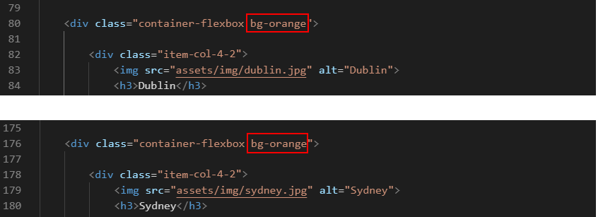
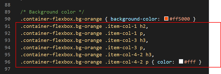
In the style.css file, you can see a class named .bg-orange has been created to apply an orange background colour. It takes effect only when combined with the container-flexbox class.
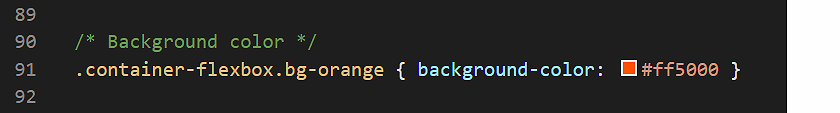
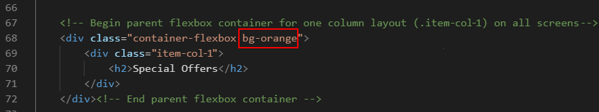
Let’s apply this bg-orange class to some of the parent flexbox containers in your web pages.
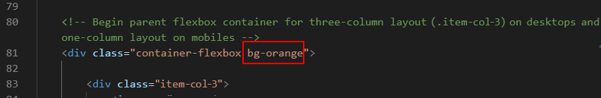
 Also, add the bg-orange class to the parent container with the three item-col-3 child items.

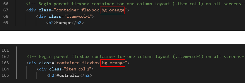 Also, add the bg-orange class name to the two parent containers with the child items of .item-col-4-2 for the locations of “Europe” and “Australia“.
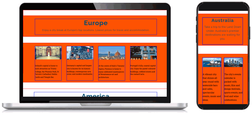
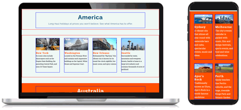
On desktop/laptop and mobile screens, your web pages should now look as shown below.

You have now finished working with the container-flexbox parent containers. All your remaining updates will be to the child columns inside the parent containers.
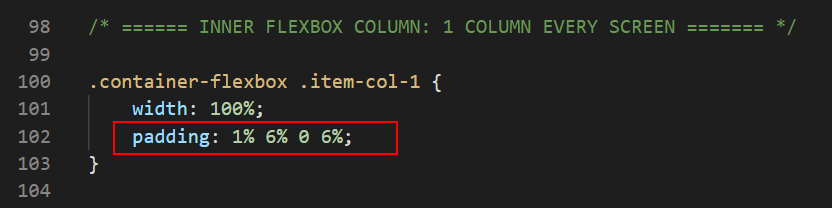
On both desktop/laptop and mobile screens, parent containers with an item-col-1 child will always display as a single column. Let's add some padding to these child items.

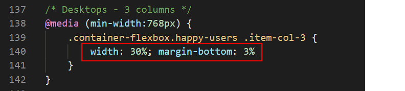
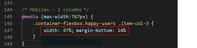
On desktop/laptop screens, the three-column layout has no gutter spacing between the child columns. Let’s change this.
 The remaining space of 10% will be added as a gutter between the child columns.
This applies only to desktop/laptop screens (768px or wider) and has no effect on mobile screens (767px or narrower).
The remaining space of 10% will be added as a gutter between the child columns.
This applies only to desktop/laptop screens (768px or wider) and has no effect on mobile screens (767px or narrower).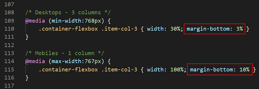

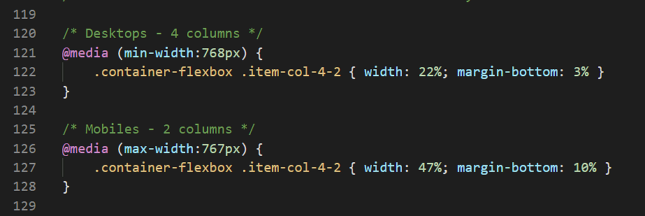
In the destinations.html web page, three of the parent containers have child columns that display as four columns on desktops/laptops and as two columns on mobiles.
These child columns have a class of .item-col-4-2. At the moment, the .item-col-4-2 class has no gutter spacing between the child items. Let’s change this.
On the about-us.html web page is a section named “Some customer testimonials”. The parent flexbox containers have a special class named happy-users. Let’s update the related style rules.
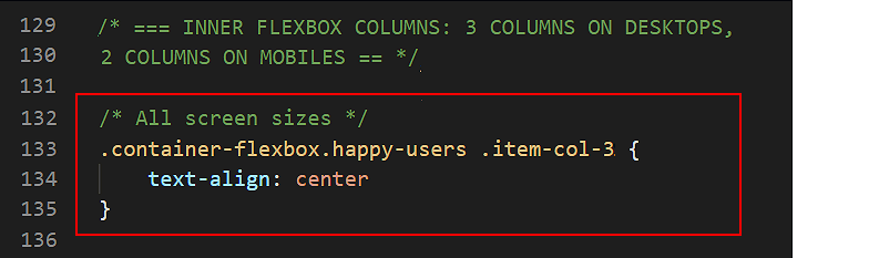
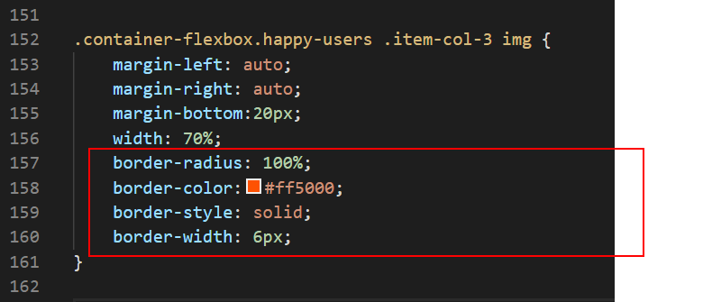 These style rules will display the images as circles, and add a coloured border around them.
You can now delete the visual layout guides from your web pages and stylesheet.
Click here to view a finished version of the travel agency website.
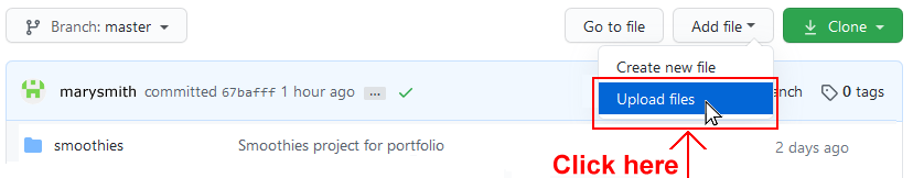
The final step is to upload your project to GitHub.
All the files for this project are in a sub-folder named travel of your websites/portfolio folder.
So you will need to upload this travel folder to your account on GitHub.
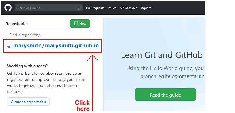
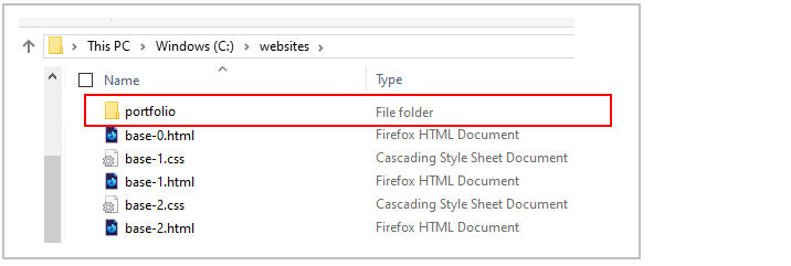
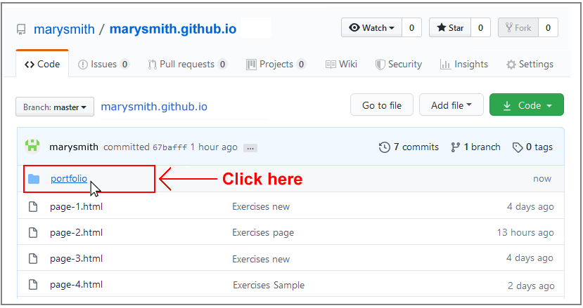
 Click the portfolio folder to access it.
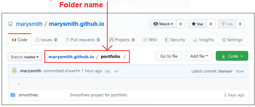
 IMPORTANT Ensure your GitHub account is displaying the portfolio folder before continuing.
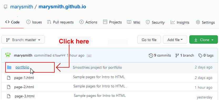
 Click the portfolio folder.
 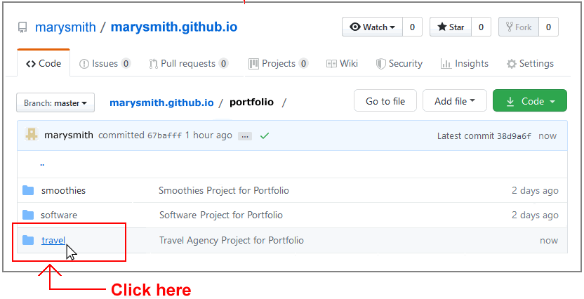 Click the travel folder.
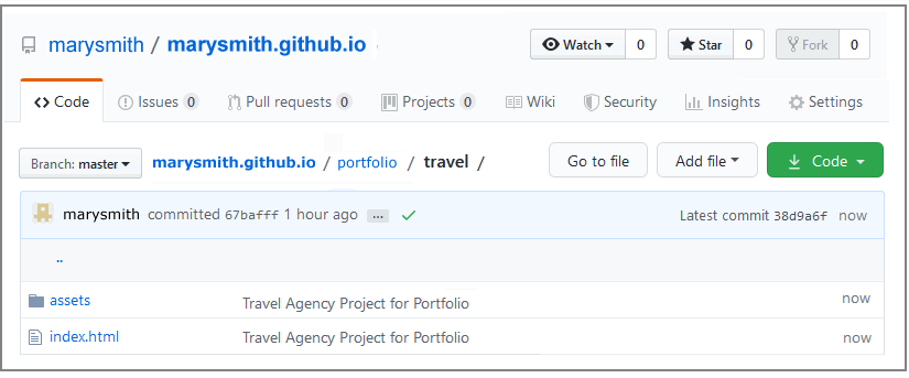
Your web page is published on GitHub at a web address similar to the following, where username is the username you have chosen for your GitHub account:
https://username.github.io/portfolio/travel/index.html
or, simply:
https://username.github.io/portfolio/travel
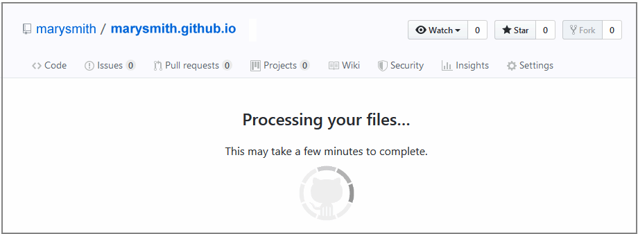
It may take a few minutes for your uploaded files to appear on GitHub.
Return to Contents.