Your first step is to download the files you need for this project.
Download the following compressed file to your computer:software.zip
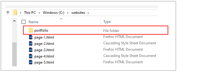
If a sub-folder named portfolio does not already exist inside your websites folder, create it now.
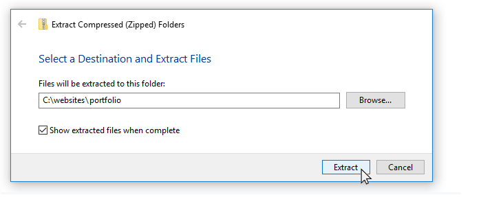
Uncompress the ZIP file into your websites/portfolio sub-folder as shown below.
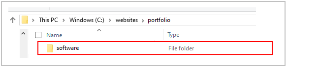
This will create a sub-folder named software inside your portfolio folder.
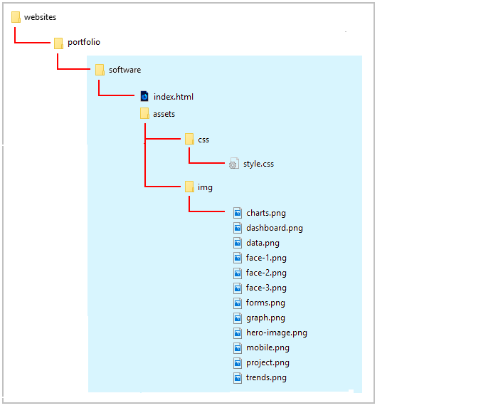
The folders, sub-folders and files for this ‘Software’ project will be as shown below.
Working with your project files
Now you can begin to work with the files you have downloaded.
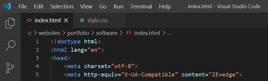
In Visual Studio Code, open the following two downloaded files. The first is the web page; the second, the stylesheet:
index.html: You will find this in the main folder of your software folder.
style.css: You will find this in the assets/css sub-folder of the software folder.
You can close any other files you may have open in VS Code.
The structure of your project web page
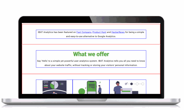
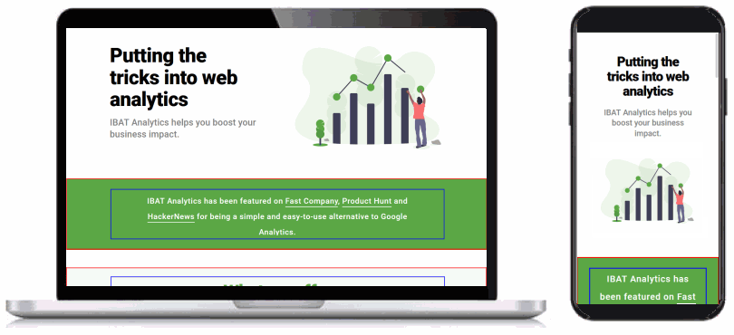
Display the project index.html web page in your Chrome or Mozilla Firefox Developer Edition browser. It should look as shown below.
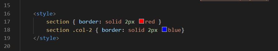
Visual layout guides
To help you distinguish between the various parent and child elements, the following two styles are added at the end to the head of the web page.
You can remove these styles as you progress through the project.
Section blocks and class names
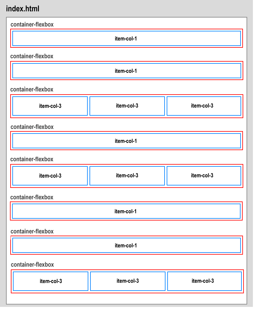
Under the two-column ‘hero’ section, the index.html web page is structured as follows:
There are eight section containers. These are the ‘parents’ of the child columns they contain.
Five of these parent containers have only a single child column, styled with the item-col-1 class.
The other parent containers each have inside them three child columns, styled with the item-col-3 class.
This flexbox parent-child structure enables the design of a two-column and three-column layout for desktop/laptop screens.
The relationship between the page structure and the class names is shown below.
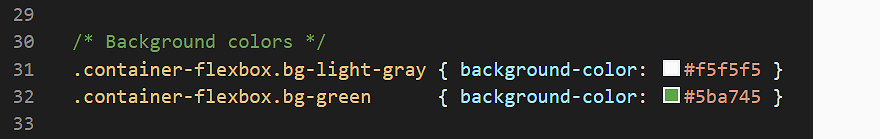
Adding background colours to the sections
In the CSS file, you can see styles have been created for two background colours.
Let’s apply these to the parent flexbox containers in your web page.
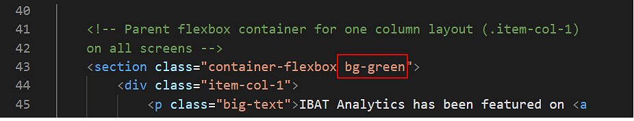
At the top of the web page is a parent container with a single child column (.item-col-1) inside it. The text in the child column begins with the words “IBAT Analytics has been featured on...”
To this parent container, add the class of bg-green.
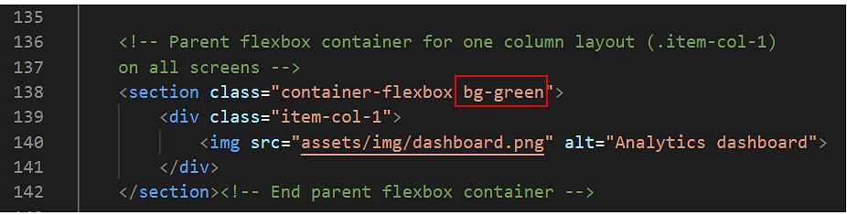
Further down the page is another parent container with just one child (item-col-1). Inside the child column is a single image named dashboard.png.
To this parent container, also add the class of bg-green.
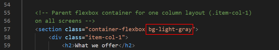
To all the six other parent containers in the web page – except the ‘hero’ container at the top – add the class of bg-light-gray. See just one example below.
Save the index.html file.
You have now finished working with the parent flexbox containers. All your remaining changes will be to the child columns inside the parent containers.
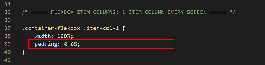
Styling the single-column layouts
On both desktop and mobile screens, parent containers with an item-col-1 child will always display as a single column. Let’s add some padding to these child items.
In your style.css stylesheet, add the following padding values for the .item-col-1 selector within all parent containers.
Save the style.css file.
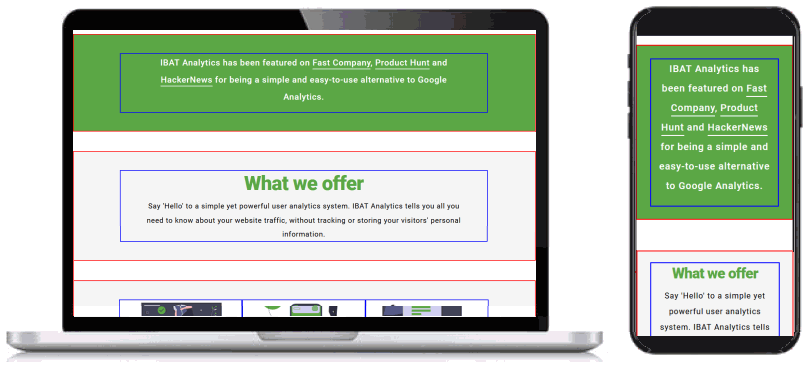
In your web browser, view the index.html web page on desktop/laptop and mobile size screens. It should look as shown below.
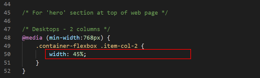
Styling the two-column layouts
Only the ‘hero’ parent container at the top of the web page has a two-column .item-col-2 layout. On desktop screens, this two-column layout has no gutter spacing between the left and right child columns. Let’s change this.
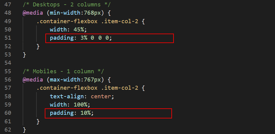
In the style.css stylesheet, within the desktop media query for the .item-col-2 class selector, reduce the width from 50% to 45% as shown below.
The remaining space of 10% will be added between the two child columns, so creating a gutter between the left and right columns.
This applies only to desktop screens (768px or wider) and has no effect on mobile screens (767px or narrower).
Next, add the following padding values for the .item-col-2 columns.
Save the style.css file.
In your web browser, view the index.html web page on desktop/laptop and mobile size screens. It should look as shown below.
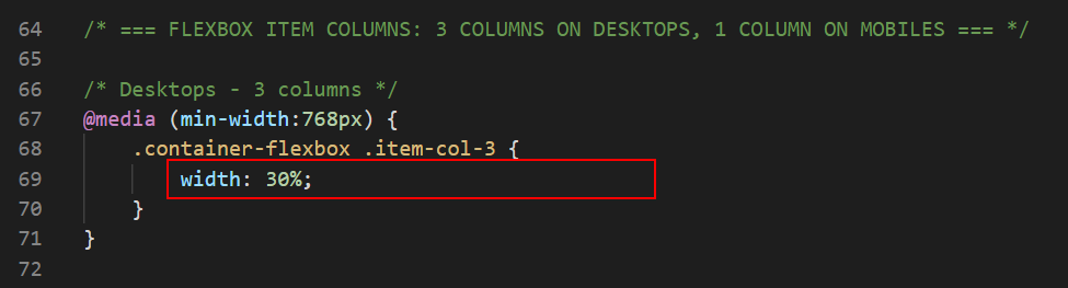
Styling the three-column layouts
On desktop screens, the three-column layout has no gutter spacing between the child columns. Let’s change this.
In the style.css stylesheet, within the desktop media query for the .item-col-3 class selector, reduce the width from 33.33% to 30% as shown below.
The remaining space of 10% will be added between the child columns.
This applies only to desktop screens (768px or wider) and has no effect on mobile screens (767px or narrower).
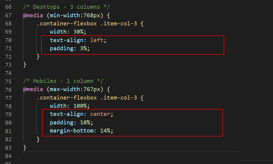
Add the following alignment, padding and margin properties and values for the .item-col-3 selector.
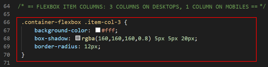
Create the following new CSS selector and styles that will apply to the .item-col-3 child items on both desktop and mobile screens. These rules set the background colour to white and add a shaded border with rounded edges.
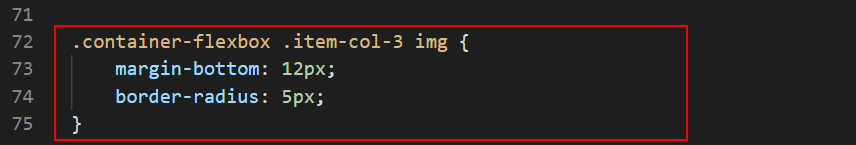
Create the following new styles that will apply to all images within the .item-col-3 child items on both desktop and mobile screens. These rules add some spacing under each image and ‘soften’ the image corners.
Save the style.css file.
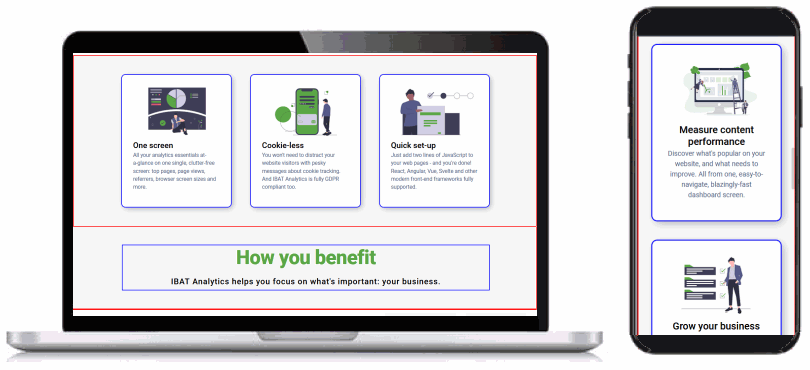
In your web browser, view the index.html web page on desktop/laptop and mobile size screens. It should look as shown below.
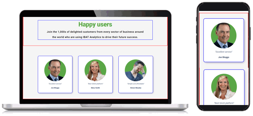
Styling the ‘happy users’ section
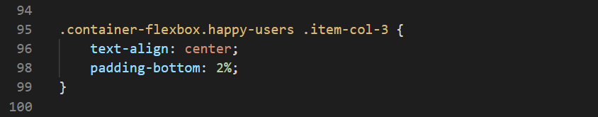
Next, let’s create some new styles that will apply only to the .item-col-3 child columns within the ‘Happy users’ section at the bottom of the web page.
The first CSS selector and set of style rules ensures the content (text and images) of the child items is always centred, on both desktop and mobile screens. It also sets the spacing below the child items.
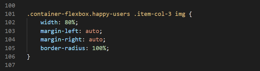
The second CSS selector and set of style rules will apply only to images inside the .item-col-3 child items within the ‘Happy users’
This reduces the width of the images to 80%, and centres the images with the margin auto value so that the remaining space of 20% is assigned equally to the left and right of the images.
Finally, the border-radius: 100% setting displays each image as a circle.
Save the style.css file.
In your web browser, view the index.html web page on desktop/laptop and mobile size screens. It should look as shown below.
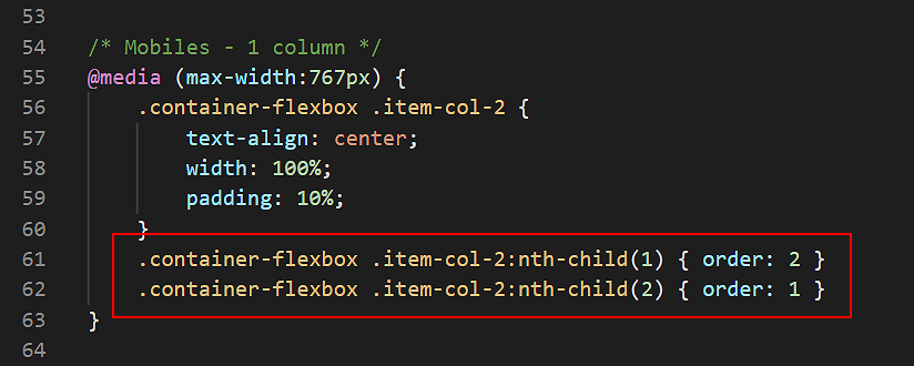
Re-order the hero items vertically on mobiles
Your next step is to re-order how the two .item-col-2 child items within the ‘hero’ section at the top of the web page are displayed on mobile screens.
If you display your web page on a mobile screen, you can see that:
The heading text appears first.
The image appears under the text.
Let’s change this.
In the style.css stylesheet, for the .item-col-2 selector, go to the media query for mobiles and add the following two styles to reorder the .item-col-2 columns.
Save the style.css file.
In your web browser, view the index.html web page on mobile size screens. It should look as shown below.
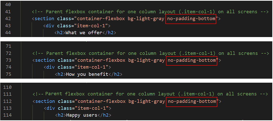
Adjusting vertical spacing
After removing the coloured borders and blank ‘spacer’ paragraphs, scroll down the web page in your web browser to check the spacing between the various elements looks correct.
On both desktop/laptop and mobile screens, you can see that there is too much vertical spacing after the following sections:
After the “What we offer” sub-heading and paragraph.
After the “How you benefit”; sub-heading and paragraph.
After the “Happy users” sub-heading and paragraph.
Let’s fix this.
At the bottom of the style.css file, add the following new selector and style rule:
Switch to the index.html web page.
Add the new class of no-padding-bottom to the three parent containers below.
When finished, save your index.html and style.css files.
The final step is to upload your project to GitHub.
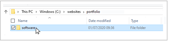
All the files for this project are in a sub-folder named software of your websites/portfolio folder.
So you will need to upload this software folder to your account on GitHub.
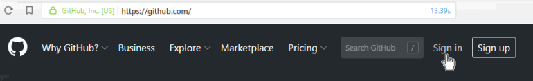
Open a new tab in your web browser and go to GitHub.com. If you are not already signed in to your GitHub account, sign in now.
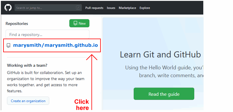
On your GitHub home page, click the name of the repository (‘repo’) that holds your web pages. Its name will look as follows, where username is your chosen username on GitHub.
username.github.io
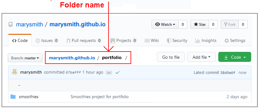
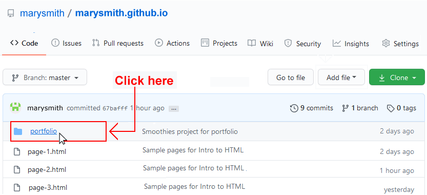
On the next screen displayed, you can see a list of the contents your repository.
At the top of the list is a folder named portfolio. You created this folder when uploading your Smoothies project.
Click the portfolio folder to access it.
Your GitHub screen should look like that shown below. You can see the portfolio folder’s name near the top of the screen.
The portfolio folder already contains the smoothies sub-folder from your previous project.
The portfolio folder is also the location to where you want to upload your software sub-folder.
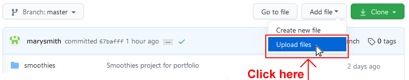
IMPORTANT Ensure that your GitHub account is displaying the portfolio folder before continuing.
Otherwise, you will upload your new project to an incorrect folder.
With the portfolio folder displayed on your GitHub screen, click the Add file button and, from the dropdown list displayed, choose the option Upload files.
You are now ready to upload the entiresoftware folder and all its contents to the portfolio folder on your GitHub account.
In File/Windows Explorer on your computer, drag-and-drop the software folder to the GitHub tab in your web browser.
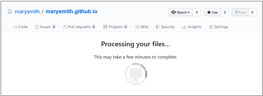
After uploading the software folder, scroll down to the bottom of the GitHub screen, enter a short message in the Commit changes box, click the Commit changes button, and wait for the upload to complete.
Your web page is now published on GitHub at a web address similar to the following, where username is the username you have chosen for your GitHub account:
 The remaining space of 10% will be added between the two child columns, so creating a gutter between the left and right columns.
 The remaining space of 10% will be added between the child columns.


 Click the portfolio folder to access it.