Introduction
This responsive single-page website for a fictitious smoothie outlet contains a showcase of multi-column layouts created with CSS flexbox.
You can display a finished version of this project by clicking the image below.
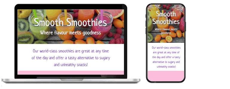
This responsive single-page website for a fictitious smoothie outlet contains a showcase of multi-column layouts created with CSS flexbox.
You can display a finished version of this project by clicking the image below.
At the end of this Tutorial you will be able to:
Portfolio project folders and files
Working with your project files
The structure of your project web page
Sub-dividing the web page with the section tag
Section blocks and class names
Adding padding to the sections
Adding background colours to the sections
Adding gutters to the two-column layout
Updating styles inside the child columns
Targeting the blueberry smoothie sub-heading and text
Centre-aligning child elements on mobile screens
Alternating child items horizontally on desktops/laptops
Reordering child items vertically on mobile screens
Your first step is to download the files you need for this project.
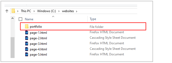
 DO NOT name your sub-folder with an upper-case ‘P’ as in Portfolio.
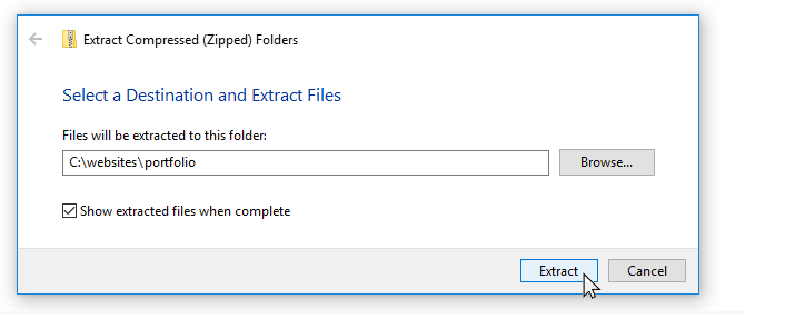
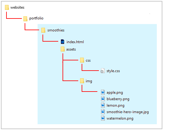
This will create a sub-folder named smoothies inside your portfolio folder.
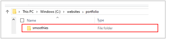
The folders, sub-folders and files for this 'Smoothies' project will be as shown below.
Now you can begin to work with the files you have downloaded.
You can close any other files you may have open in VS Code.
Display the project index.html web page in your Chrome or Mozilla Firefox Developer Edition browser. It should look as shown below.
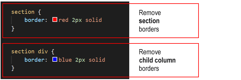
To help you distinguish between the various parent and child elements, the following two styles are added at the end of the style.css stylesheet.
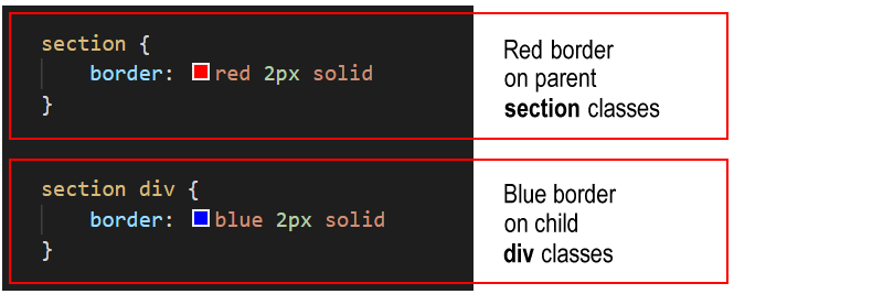
You can remove these styles as you progress through the project.
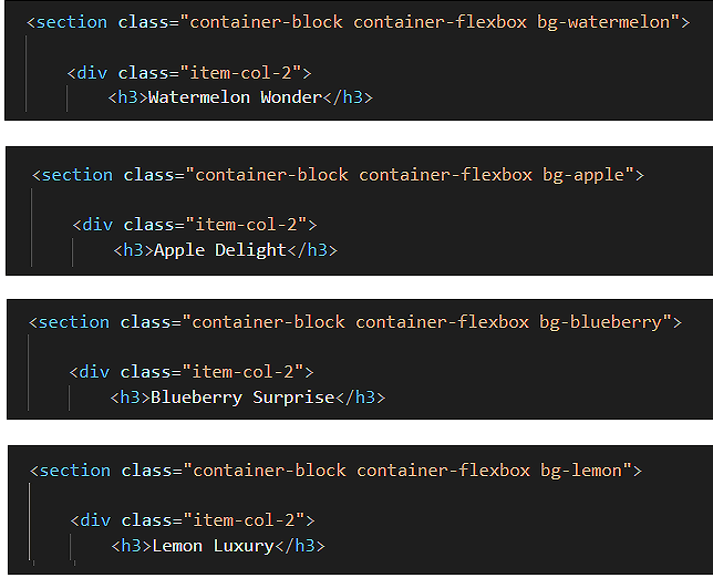
As you can see, the index.html web page is sub-divided or structured into five main ‘content blocks’.
You could use the <div> ... </div> tag pair to sub-divide the web page into blocks.
But a better, more modern HTML5 way is to use another tag pair with the same effect: <section> ... </section>.
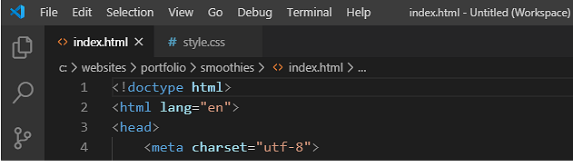
In VS Code, you can see that the index.html web page is structured as follows:


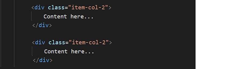
This flexbox parent-child structure enables the design of a two-column layout for desktop/laptop screens.
The relationship between the page structure and the class names is shown below.
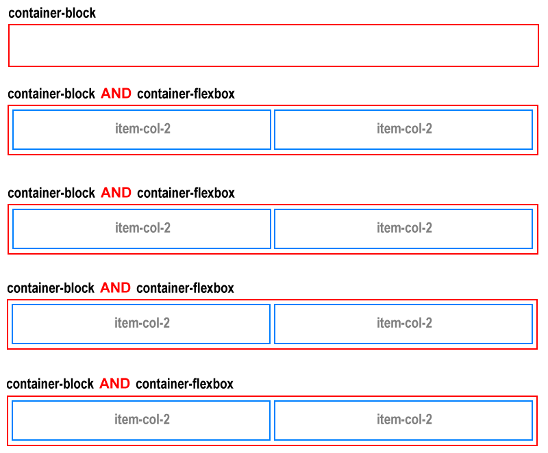
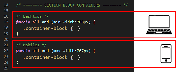
The purpose of the container-block class is to add spacing around the four inside edges (top, right, bottom and left) of the section containers.
Follow these steps to add this spacing.
 At the moment, the two .container-block selectors have no values set for them.
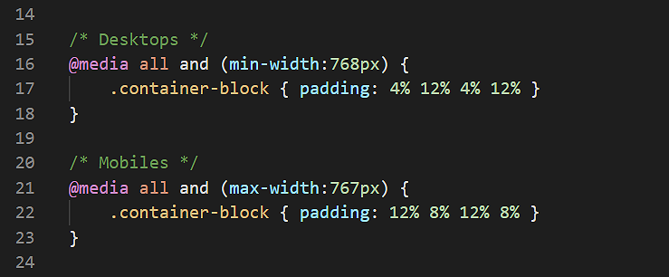
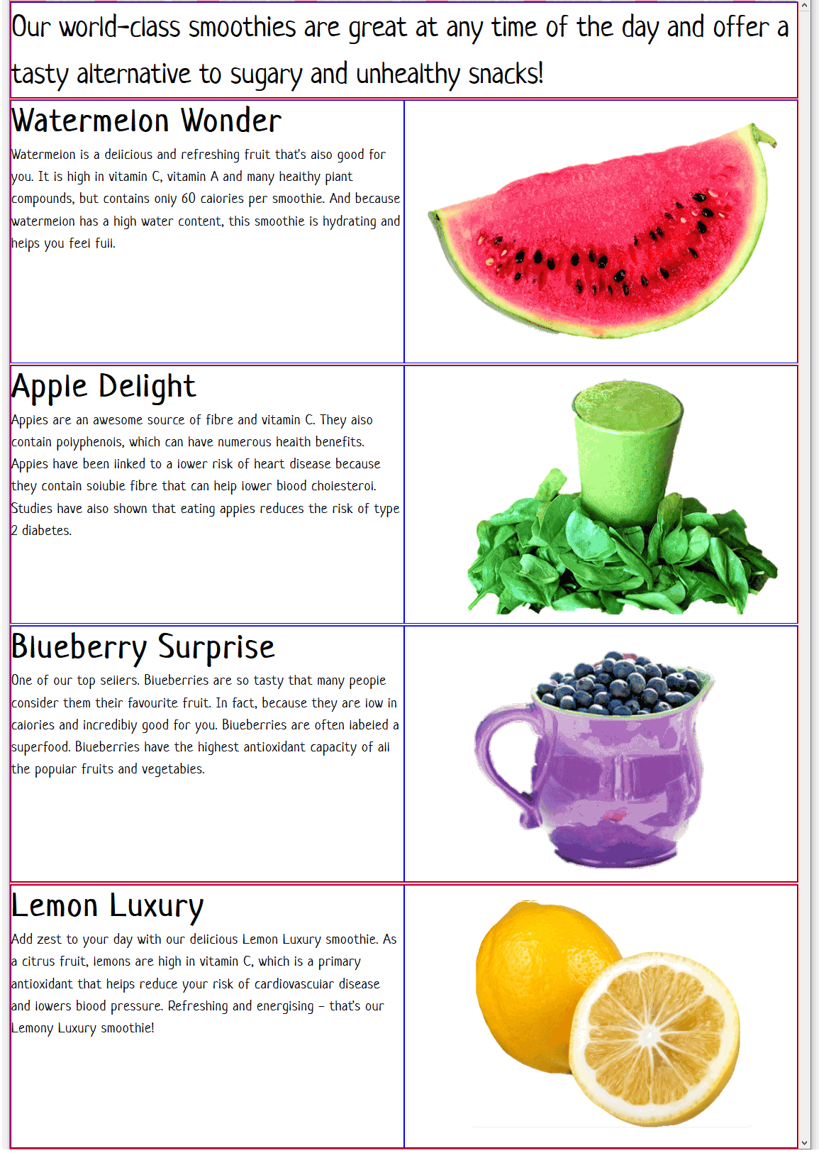
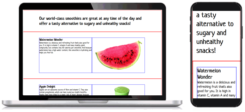
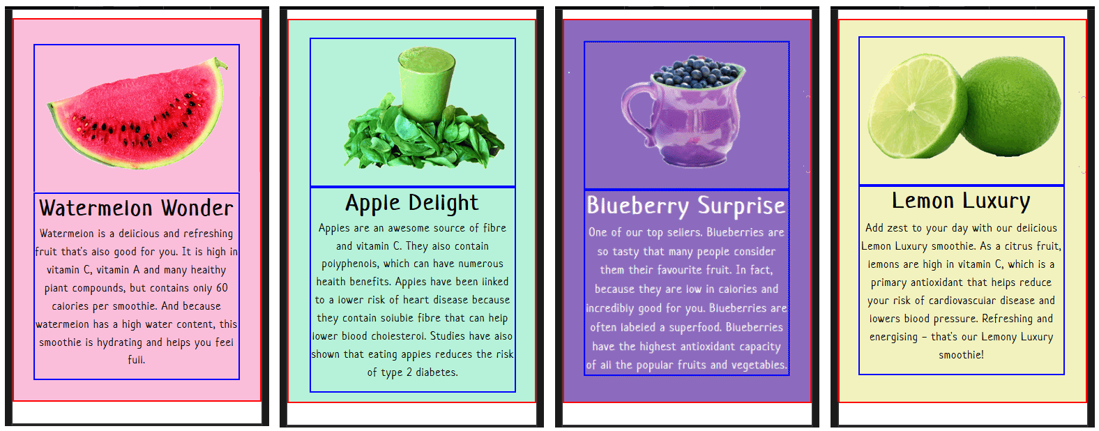
In your web browser, view the web page on desktop/laptop and mobile size screens. It should look as shown below.
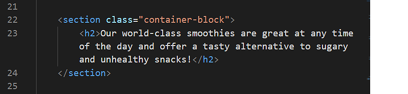
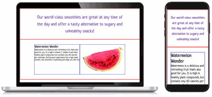
At the top of the index.html web page, just after the opening <body> tag, you can see a container-block section containing text enclosed within a <h2> ... </h2> tag pair.
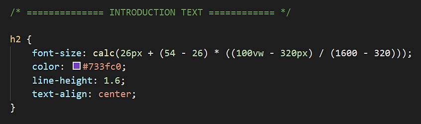
font-size: calc(26px + (54 - 26) * ((100vw - 320px) / (1600 - 320)));
color: #733fc0;
text-align: center;
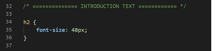
line-height: 1.6;The h2 selector and its declaration of style rules should now look as shown below.
In your web browser, view the web page on desktop/laptop and mobile size screens. It should look as shown below.
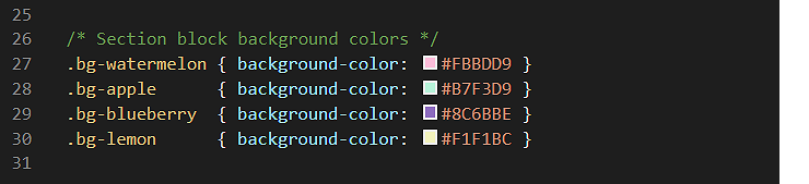
In the style.css stylesheet, you can see four selectors with style rules have been created for background colour values.
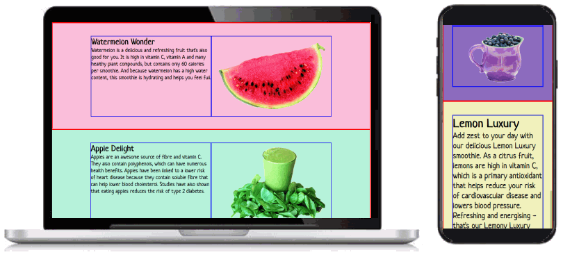
Let’s apply these background colour classes to your project web page.
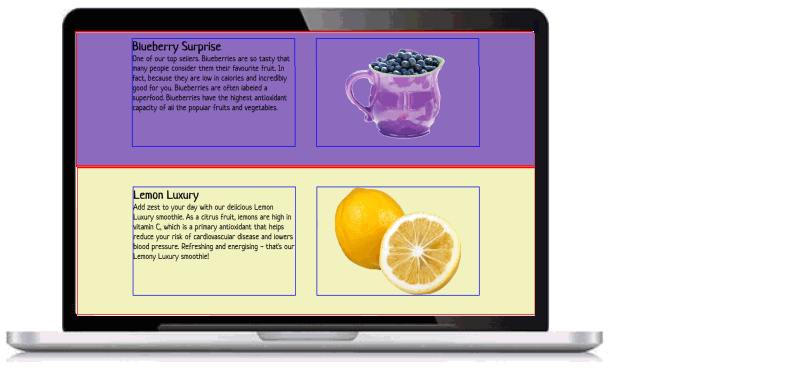
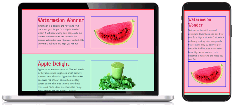
In your web browser, view the web page on desktop/laptop and mobile size screens. It should look as shown below.
On desktop/laptop screens, the two-column layout for each of the four smoothies has no gutter spacing between the left and right child items.
Let’s change this.
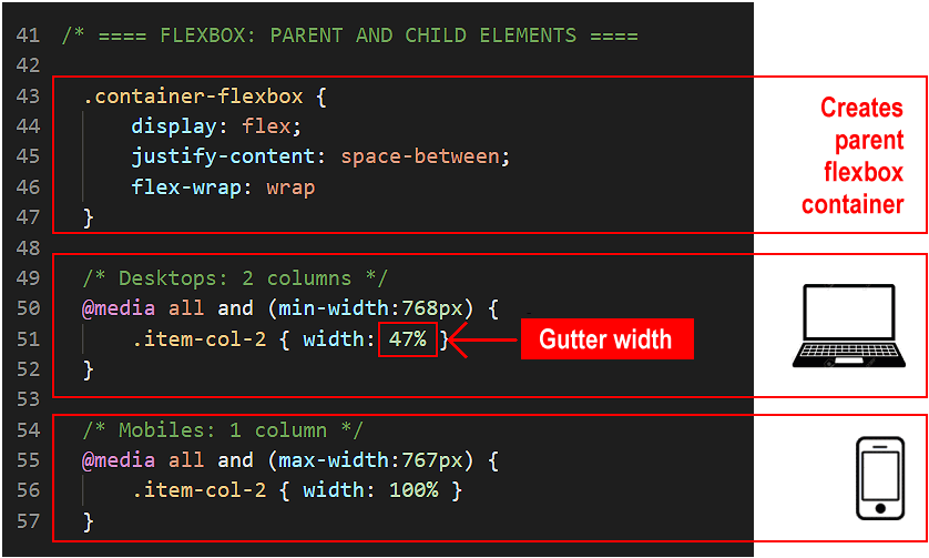 The remaining 6% of horizontal space will be added between the two child items, so creating a gutter between the left and right columns.
In your web browser, view the web page on desktop/laptop size screens. It should look as shown below.
The above changes apply only to desktop/laptop screens (768px or wider) and have no effect on mobile screens (767px or narrower).
On mobile screens, the item-col-2 child columns will always fill the full width (100%) of the parent flexbox container.
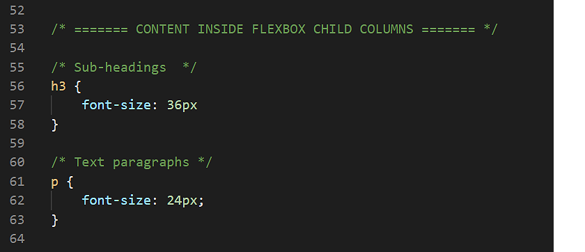
The next step is to update the styles of the h3 sub-headings and p text paragraphs within the item-col-2 child columns.
  font-size: calc(32px + (64 - 32) * ((100vw - 320px) / (1600 - 320)));
  color: #d1274b;
  letter-spacing: 2px;
  margin-bottom: 4px;
  font-size: calc(16px + (24 - 16) * ((100vw - 320px) / (1600 - 320)));
  color: #2F4F4F;
  letter-spacing: 1px;
  line-height: 1.6;
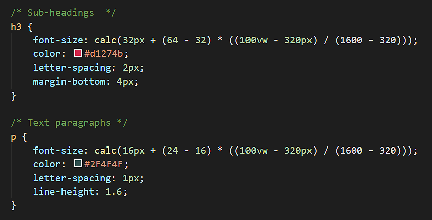
In your web browser, view the web page on desktop/laptop size screens. It should look as shown below.
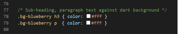
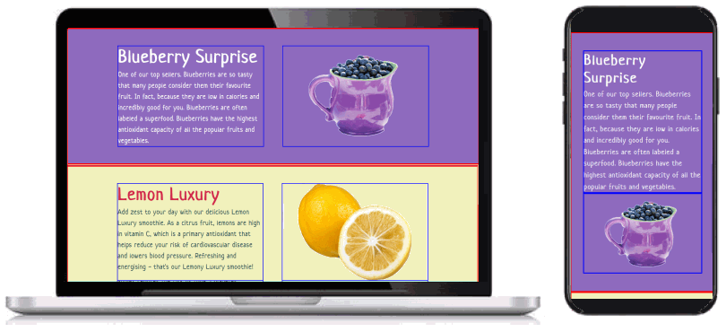
Of the four smoothies, the sub-heading and text of the blueberry one is difficult to read. You need to increase the colour contrast between the words and the purple background.
One option would be to change the text colours to white, for both the sub-heading and the text paragraph, as follows.
  h3 { color: #fff; }
  p { color: #fff; }
Unfortunately, this causes the sub-headings and text of all four smoothies to be displayed in a white colour. This is not what you want.
What you want is your style.css stylesheet to ‘target’ the h3 and p elements of the blueberry smoothie so that only they are displayed in white.
In the index.html file, you can see that only the blueberry smoothie has a class name of bg-blueberry applied to it. None of the three other smoothies have this class name.
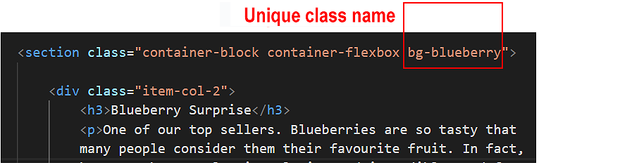
Therefore, in your CSS stylesheet, you can target the sub-heading and text paragraph within this block with the following parent-child selectors.
  .bg-bluebery h3 { some property: some value; }
  .bg-blueberry p { some property: some value; }
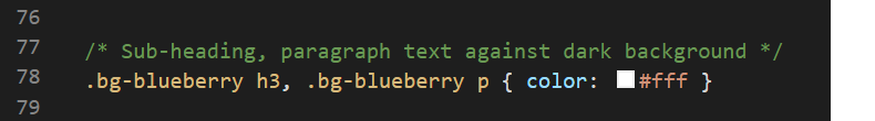
Let’s do that now.
 Or, in shorter form.
In your web browser, view the web page on desktop/laptop and mobile size screens. It should look as shown below.
By default, headings and text paragraphs within web pages are aligned against the left edge of their containing element.
For mobile screens only, let’s centre-align the sub-headings and paragraphs of the four smoothies.
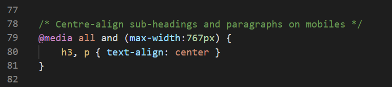
In your web browser, view the web page on a mobile size screen. It should look as shown below.
On desktop/laptop screens, for all four smoothies, the sub-heading and text are always positioned in the left column and the image in the right.
Follow the steps below to alternate how the two-column layouts for each of the four smoothies are displayed on screens of 768px width or above.
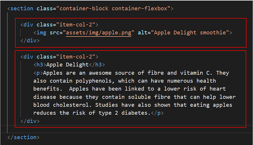 On desktop/laptop screens, this will position the apple image in the left column, and the text in the right column.
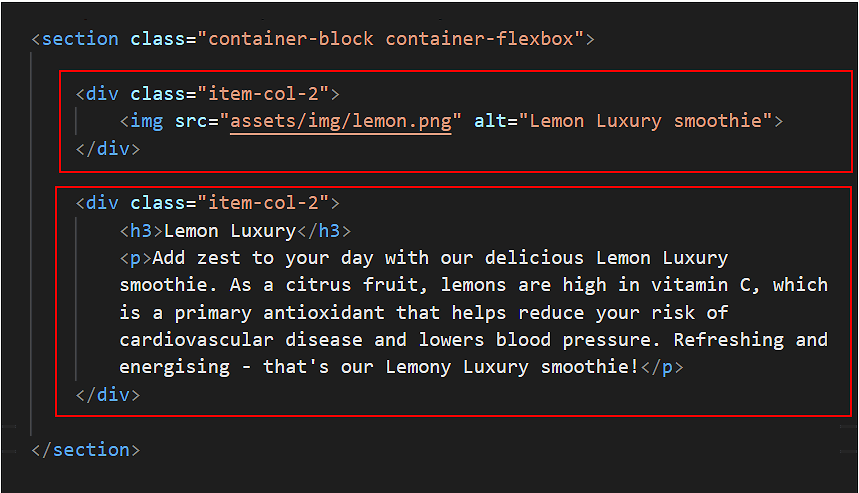 On desktop/laptop screens, this will position the lemon image in the left column, and the text in the right column.
Save the index.html file, and, in your web browser, view the effect on your web page on screen widths of 768px or greater.
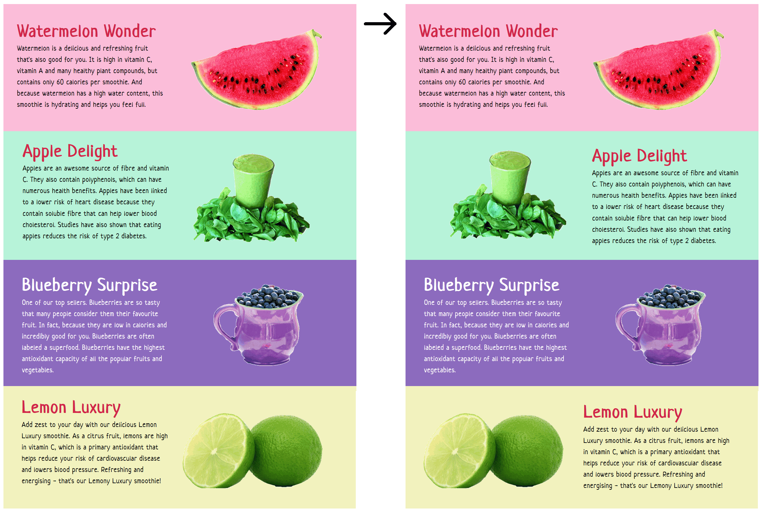
In the previous section, you swapped the left-right positions of the images and text for two of the four smoothies: the second (Apple) smoothie) and the fourth (Lemon) smoothie.
On desktop/laptop screens, this introduced some variety to the visual layout of your web page.
Now, let's examine your web page layout on mobile-sized screens.
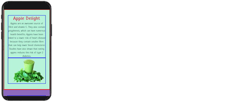
In visual content layout, the general standard is as follows: first the image, then heading and finally text. See the examples below.

If you display your web page on a mobile screen, you can see that:
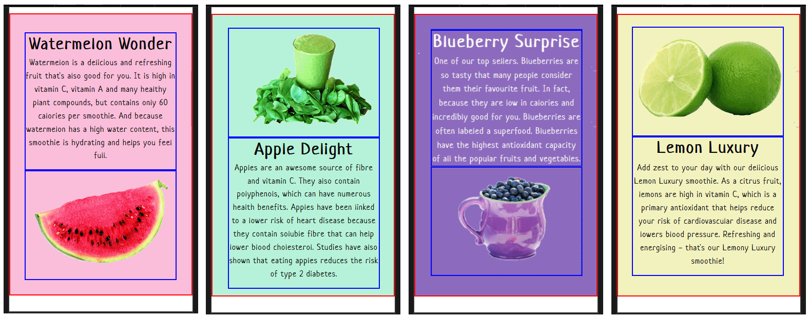
Let’s change the first and third smoothie child items, so that for all four smoothies, the image is always displayed above the sub-heading and text.
/* Mobiles: Re-order columns inside first and third flexbox parent containers */
  .bg-watermelon .item-col-2 { some property: some value; }
In this case, you want to target each of the two child elements individually. You can do this with the :nth-child(some number) selector. So you would type:
  .bg-watermelon .item-col-2:nth-child(1) { some property: some value; }
  .bg-watermelon .item-col-2:nth-child(2) { some property: some value; }
  .bg-lemon .item-col-2:nth-child(1) { some property: some value; }
  .bg-lemon .item-col-2:nth-child(2) { some property: some value; }
/* Mobiles: Re-order columns inside first and third flexbox parent containers */
@media (max-width: 767px) {
  .bg-watermelon .item-col-2:nth-child(1) { some property: some value; }
  .bg-watermelon .item-col-2:nth-child(2) { some property: some value; }
  .bg-lemon      .item-col-2:nth-child(1) { some property: some value; }
  .bg-lemon      .item-col-2:nth-child(2) { some property: some value; }
}
/* Mobiles: Re-order columns inside first and third flexbox parent containers */
@media all and (max-width: 767px) {
  .bg-watermelon .item-col-2:nth-child(1) { order: 2; }
  .bg-watermelon .item-col-2:nth-child(2) { order: 1; }
  .bg-lemon      .item-col-2:nth-child(1) { order: 2; }
  .bg-lemon      .item-col-2:nth-child(2) { order: 1; }
}
Save the style.css file, and, with your web browser sized for mobile screens, view the effect on your web page. It should look as shown below.
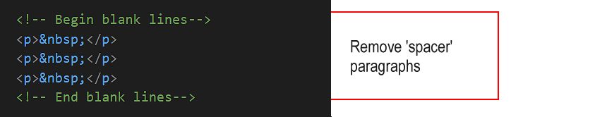
You can now delete the visual layout aids from your web pages and stylesheet.
You have now completed this Tutorial.
You can display a finished version of the project web page by clicking the image below.
In later Tutorials for this portfolio project you will add an email sign-up form, a footer and menus.
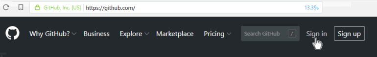
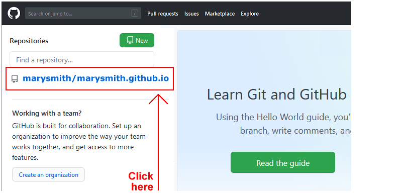
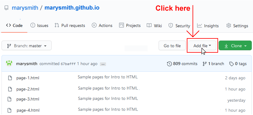
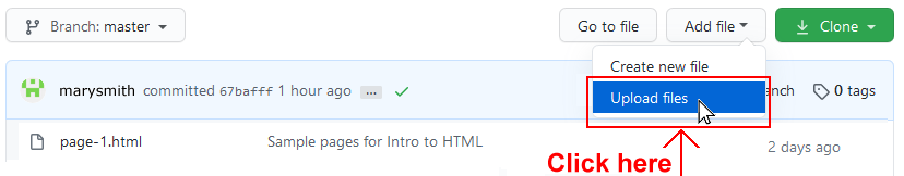
The final step is to upload your project to GitHub.
Before you upload your style.css stylesheet, remove the visual layout guides.
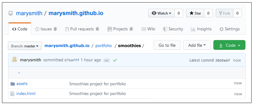
All the files for this project are in a sub-folder named smoothies of your websites/portfolio folder.
So you will need to upload this portfolio folder, which contains both files and sub-folders, to your account on GitHub.
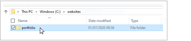
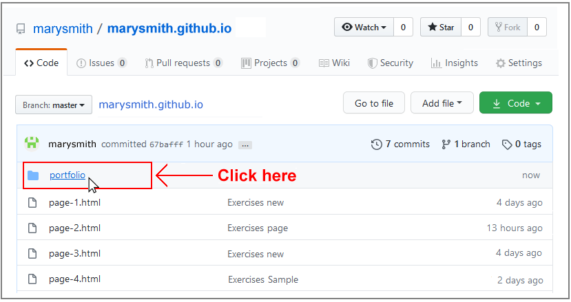 Click on this to view its contents. It should contain the smoothies sub-folder. Click on this to see both the index.html file and the assets sub-folder.
Your web page is now published on GitHub at a web address similar to the following, where username is the username you have chosen for your GitHub account:
https://username.github.io/portfolio/smoothies/index.html
Or, simply:
https://username.github.io/portfolio/smoothies
It may take a few minutes for your uploaded files to appear on GitHub.
Return to Contents.