
Learning Goals
At the end of this Tutorial, you will be able to:
- Style HTML5-compliant section elements to create vertically divided blocks of content in a web page.
- With minimal font and colour-related updates, reuse a stylesheet with common section CSS values to quickly build web pages with very different visual styles.
You can view finished versions of the three sample web pages you will create in this Tutorial by clicking the links below. The finished samples will each open in a new tab of your web browser.
Downloading your sample files
Your first task is to download the three files you need for this Tutorial.
- In Google Chrome, Brave or Mozilla Firefox Developer Edition, click the following web address: page-11.html This HTML file will open in a new tab of your web browser.
- Right-click anywhere in the web page and choose View Page Source from the context menu displayed.
Next, right-click anywhere on the web page source and choose Save as... (Chrome or Brave) or Save Page As... (Firefox) from the context menu displayed.
Save the web page in the exercises sub-folder of your websites folder with the name page-11.html
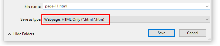 Ensure the Save as type: dropdown list is set to Webpage, HTML only (*.HTML, *.htm).
When finished, you can close the browser tab containing the page-11.html web page.
Ensure the Save as type: dropdown list is set to Webpage, HTML only (*.HTML, *.htm).
When finished, you can close the browser tab containing the page-11.html web page. - Next, click the following web address: style-11.css This stylesheet file will open in a new tab of your web browser.
- Right-click anywhere in the browser window, and from the context menu, choose Save as... (Chrome/Brave) or Save Page As... (Firefox).
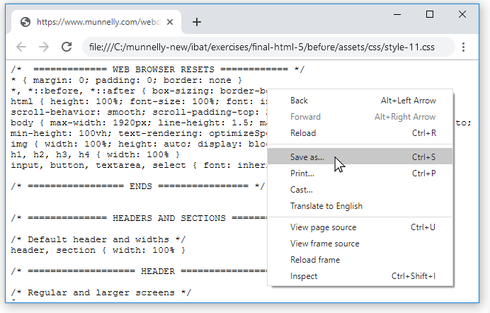
- Save the style-11.css stylesheet file in your websites/exercises/assets/css sub-folder.
- Finally, save the following image to your websites/exercises/assets/img sub-folder:
 three-staff.png
Working with your first sample web page
You are now ready to work with your downloaded sample web page and stylesheet.
- Start VS Code, and then open the following two files:
page-11.html
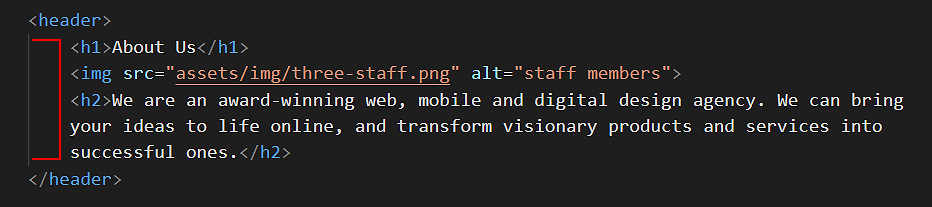
style-11.css - In the HTML file, you can see that the body of the web page begins with a header block with three child elements: a main <h1> heading, an <img> image and an <h2> sub-heading.
- Under the header is the main block containing a single article.
These two opening tags are closed at the end of the web page.
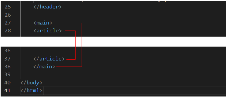 The main and the article tags are included solely to ensure the web page is HTML5 compliant. These two tags are not used to style any element in the page.
 - Within the article is a block of content inside a section which is a parent element to three child elements: a <h1> heading and two p paragraphs.
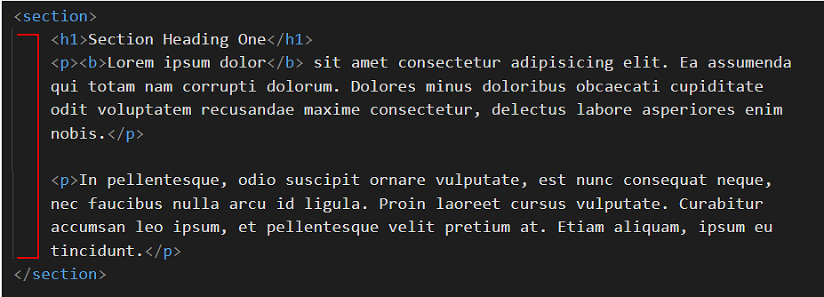 Note that, for each of the two parent elements of header and section, the child elements are indented in from the left edge of the VS Code screen.
 - Copy-and-paste three copies of the section block within the page.
Update the text within the <h1> heading from “Section Heading One“ to “Section Heading Two“, “Section Heading Three“ and “Section Heading Four“.
Your web page should now look as shown below.
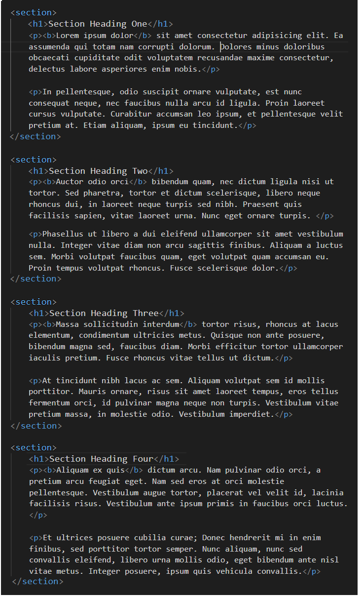 In every case, ensure the child elements are indented from the left edge of the VS Code screen.
 - Scroll up to the top of the web page.
In the head block, after the link to the style-11.css stylesheet, copy-and-paste the following new style rule that will apply to both the header and section blocks within the page.
<style>
header, section {
    border: solid 2px red;
}
</style>
The head block should now look as shown below.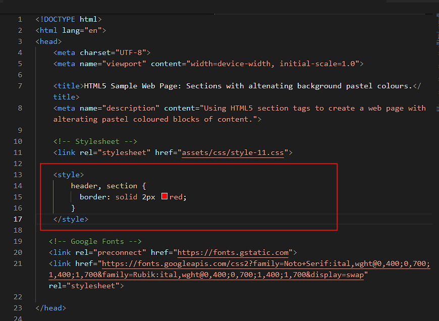
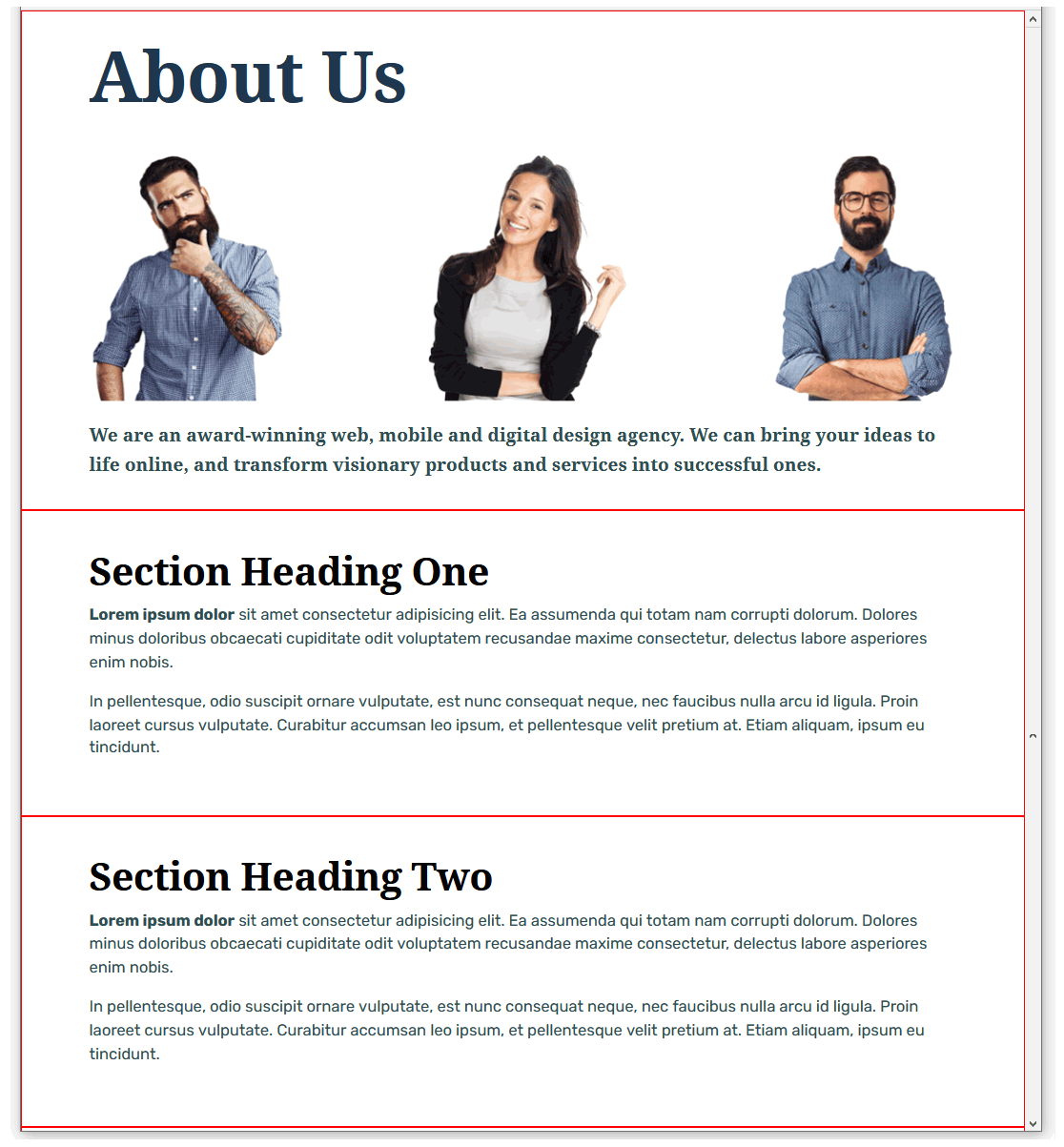
- When finished, save the page-11.html file and view it in your web browser. It should look as shown below.
You can view a sample of the web page as it now looks by clicking the link below.
page-11.html (with red borders around header and section blocks)
The red border technique for visualising content blocks
The placing of a thin, red-coloured border around HTML content blocks elements is a common technique or ‘hack’ used by designers to help them view a web page’s structural layout in the web browser.
Working with your sample CSS file
Next, display the linked style-11.css stylesheet file in VS Code.
You can see that, for the following range of viewport widths, horizontal and padding values have been added fo the header and sections blocks:
- 1200px and wider (larger screens)
- 1025px to 1199px (tablets and smaller screens)
- 768px to 1024px (tablets)
- 400px to 767px (larger mobiles)
- Up to 399px (smaller mobiles)
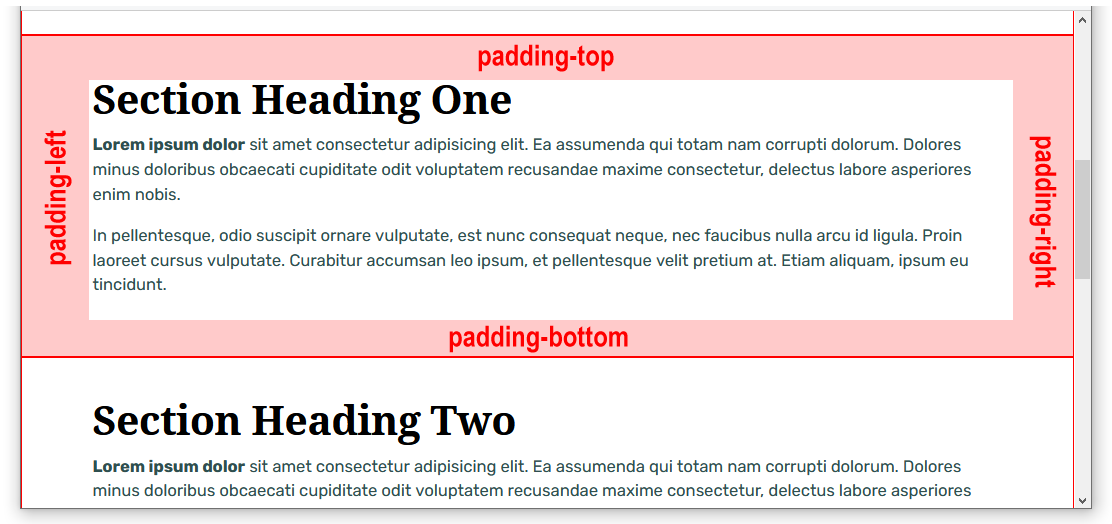
These (sort of) standard padding spacing values should work for most if not all web pages created with the HTML5 section element.
Adding a CSS class for single-column layouts
The left and right ‘white space’ set by the padding values in the style-11.css stylesheet is fine for busy, crowded, multi-column page layouts.
For simple, single-column layouts, let's add a new class in the CSS file that adds more horizontal white space. This will apply only to wider viewport sizes.
- In VS Code, display the style-11.css file.
- For the header element, within the (min-width: 1200px) media query, copy-and-paste the following new CSS class at about line 30.
.header-narrow {
     padding-left: calc( (100% - 920px)/2 );
     padding-right: calc( (100% - 920px)/2 );
}
The result should look as follows.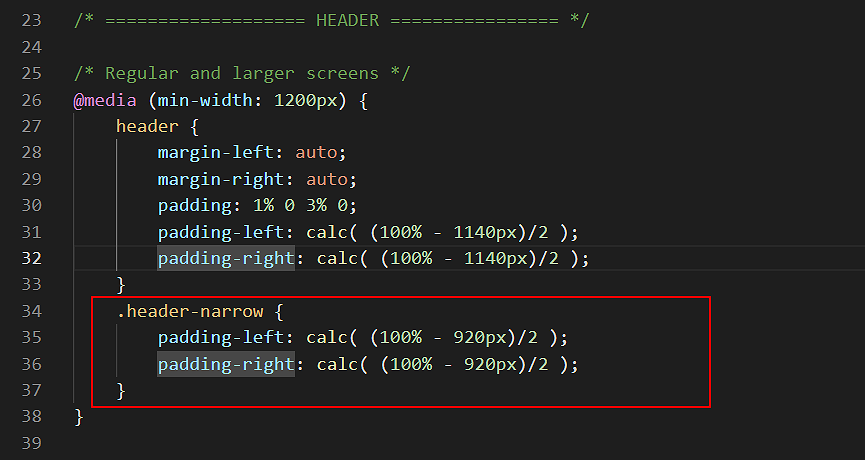
- For the section element, again within the (min-width: 1200px) media query, copy-and-paste the following new CSS class at about line 98.
.section-narrow {
     padding-left: calc( (100% - 920px)/2 );
     padding-right: calc( (100% - 920px)/2 );
}
The result should look as follows.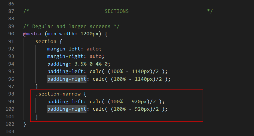
- Next, set an 800px limit on the width of the image in the header block. To do so, update the current header img selector in the CSS file (at about line 60) by copying-and-pasting the following:
/* Image in header */
header img {
    max-width: 800px;
    margin-left: auto;
    margin-right: auto;
    margin-bottom: 24px;
}
The left and right margin values of auto distribute any remaining horizontal spacing equally at the left and right of the image when the image is cente-aligned. - Save your style-11.css file.
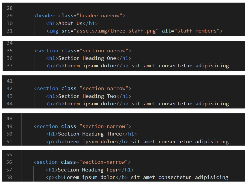
- In VS Code, switch to the page-11.html file, and add the new, narrow classes you created to the header and section blocks as shown below.
- When finished, save your page-11.html file and view it in your web browser. It should now look as follows.
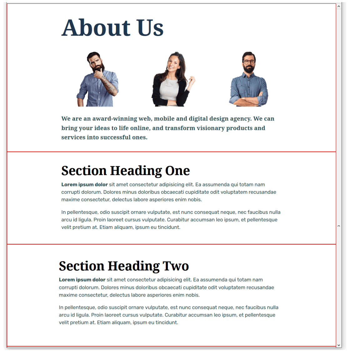
You can view a sample of the web page as it now looks by clicking the link below.
page-11.html (with narrower header and section blocks)
Centering the header block
The next task is to change the alignment of the content within the header block, from left-aligned to centre-aligned.
We will follow and approach that:
- Does not require editing (and perhaps breaking!) any existing style rules in the stylesheet.
- Will not affect the appearance of any other web page that might be based on the current stylesheet.
- Increases the re-usability of the stylesheet for other web pages we may create in the future.
Here are the steps.
- In VS Code, scroll down to the bottom of the style-11.css stylesheet.
- Copy-and-paste the following comment and new style rule to the end of the file.
=============== UTILTY CLASSES ==============
.text-center { text-align: center !important }
That this style rule is positioned at the end of the stylesheet means that it will override any other style above it that it might conflict with. The !important keyword makes doubly-certain this style rule always ‘wins’ any conflict with other styles. - When finished, save the style-11.css stylesheet.
- Switch to the page-11.html web page, and add the new utility class you have created to the header block as follows.
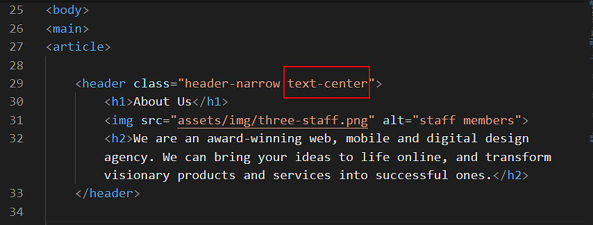
- When finished, save your page-11.html file and view it in your web browser. It should now look as follows.

You can view a sample of the web page as it currently looks by clicking the link below.
page-11.html (with centred header block)
Adding background colours
In the next few steps, you will add some new classes to create different background colours for your web page.
- At the bottom of your style-11.css stylesheet, but before the utility class, copy-and-paste the following three new selectors and style rules. Each selector does only one task: it adds a background colour.
/* Coloured backgrounds */
.bg-header   { background-color: #f5f9fb }
.bg-pastel-1 { background-color: #BEC7B4 }
.bg-pastel-2 { background-color: #DEE2D9 }
The final few lines of your CSS file should now look as follows.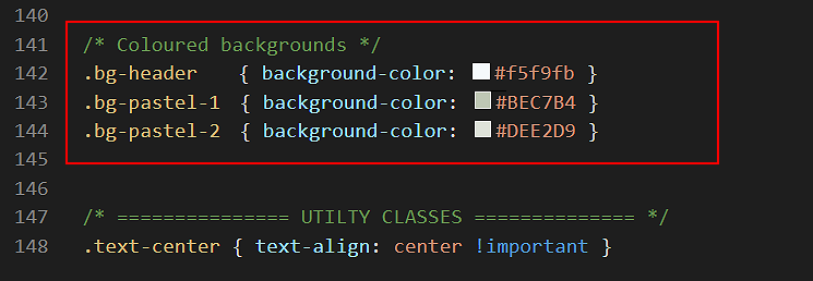 When finished, save your style-11.css file.
 - In VS Code, switch to the page-11.html web page.
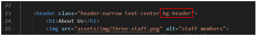
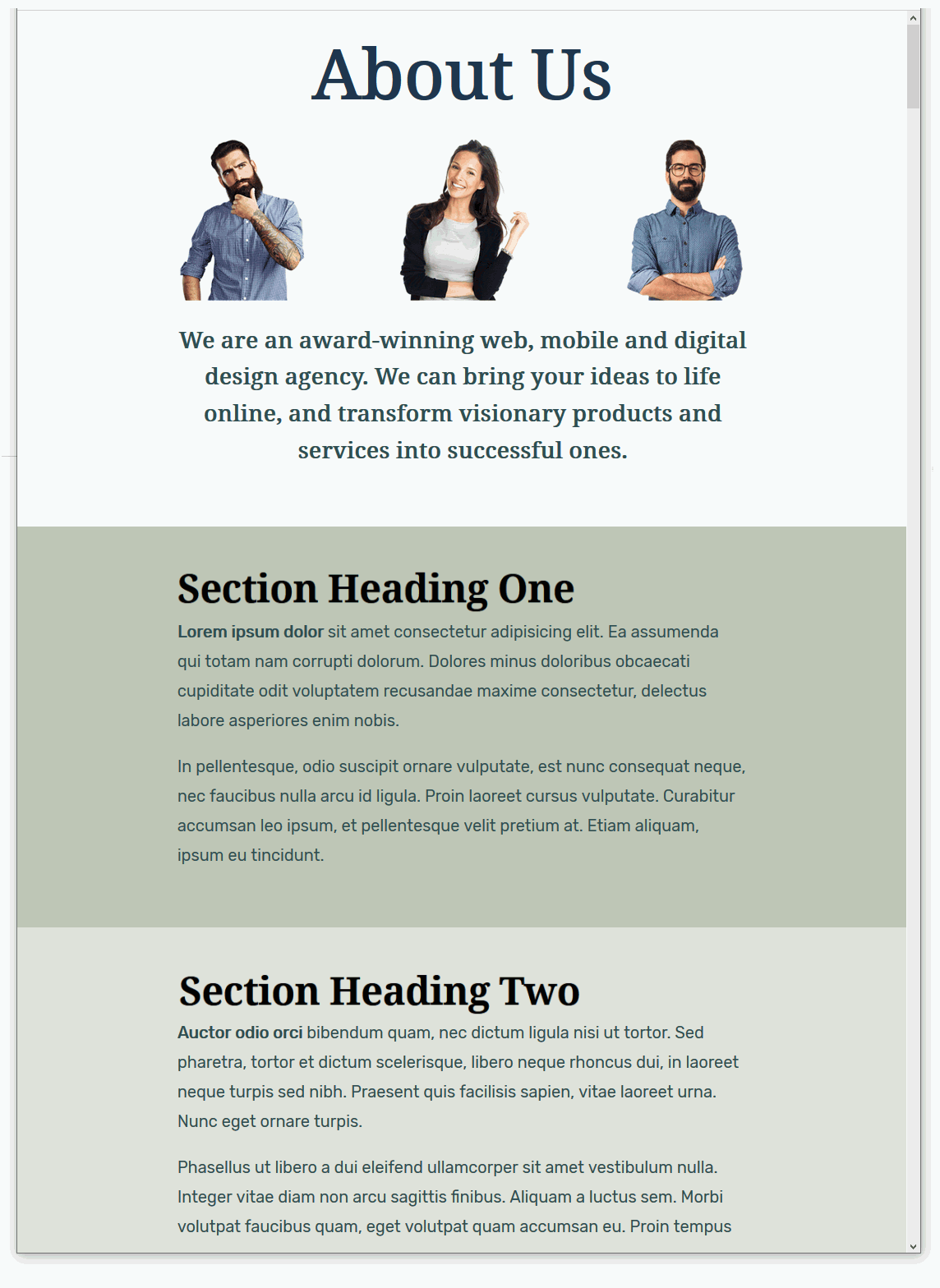
To the header block, add the new bg-header class as shown below.
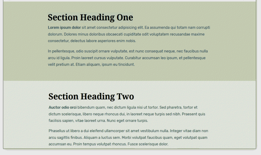
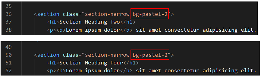
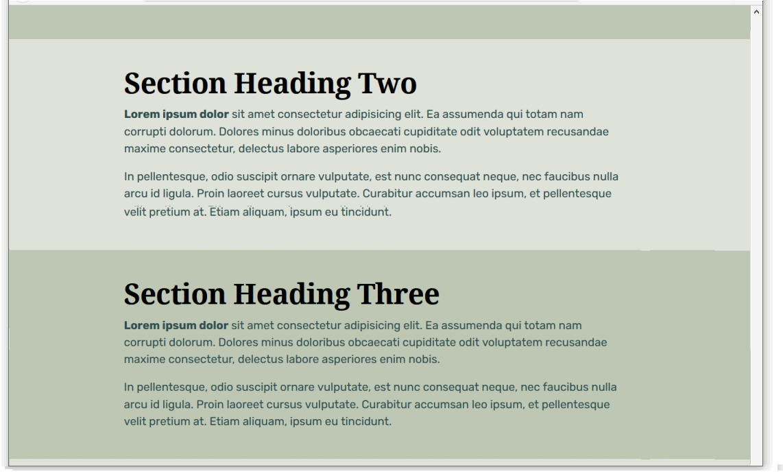
- To the first and third section blocks add the new bg-pastel-1 class as shown below.
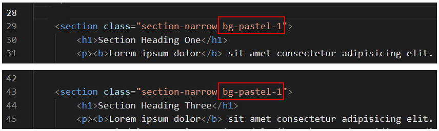
- To the second and fourth section blocks, add the new bg-pastel-2 class as shown below.
- You can now delete the ‘red box’ style rule from the head of the web page.
A better option might be to wrap it inside comment tags, just in case you want to reuse this visual guide again later. To do so, copy-and-paste the following lines over the current ‘red box’ style rule.
<!-- <style> header, section { border: solid 2px red; } </style> --> - Save the page-11.html file and display it in your web browser. It should now look as shown below.
You can view a sample of the web page as it now looks by clicking the link below.
page-11.html (with alternating background colours)
Controlling the vertical spacing
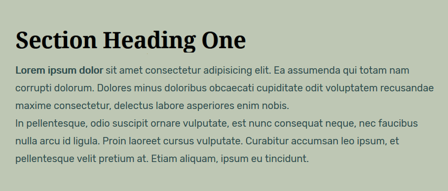
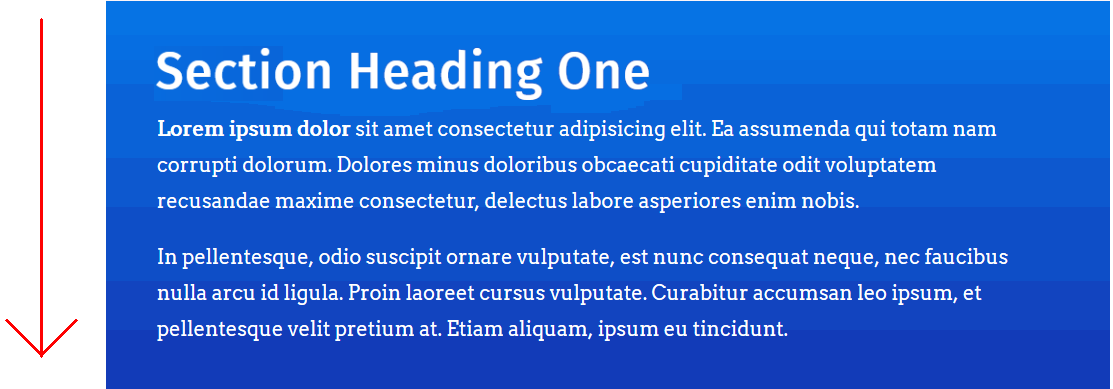
One problem remains with your web page: there is more vertical spacing below the content of your section blocks than above them.
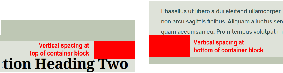
This does not look right.
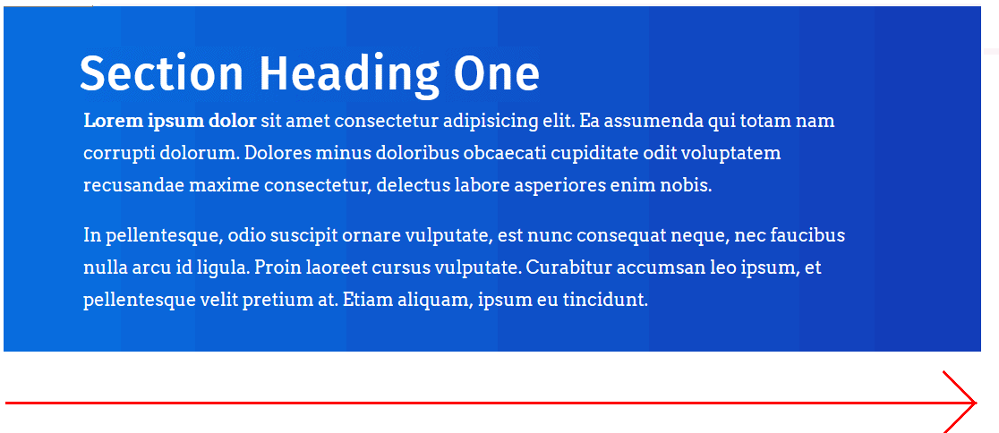
A more professional and visually pleasing web page would have equal vertical spacing at the top and the bottom of the content within the section blocks. See below.
The extra vertical spacing at the bottom of your section blocks is the result of the margin-bottom value of the <p> paragraph tag.
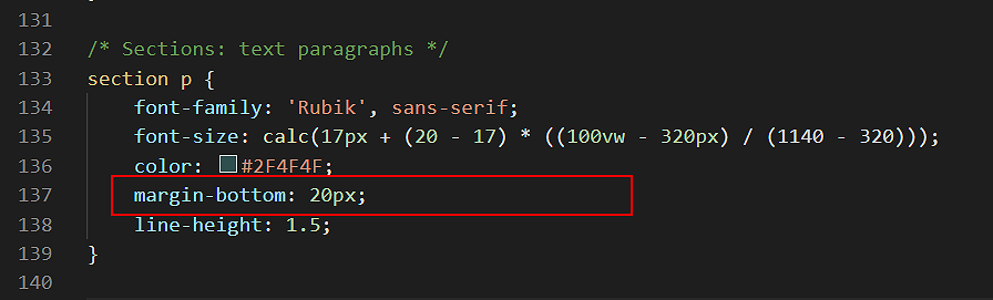
You could delete this CSS style rule from the p paragraph styles. Then your paragraphs would have a margin-bottom value of zero, as set out in the web browser resets at the top of your stylesheet file.
Unfortunately, there would be no vertical spacing between <p> paragraphs of text within your section blocks. See below.
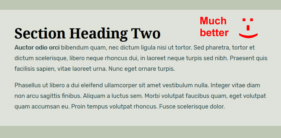
A more correct solution is as follows:
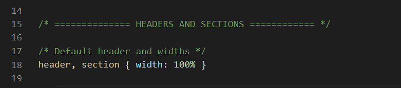
- In your style-11.css stylesheet, scroll to the top. At about line 18 you can see a style rule that sets the width of both the header and section elements to 100%.
- Directly under this line, copy-and-paste this new comment and style rule.
/* Last element at bottom of header or section */
header *:last-child, section *:last-child { margin-bottom: 0 }
Your stylesheet should now look as follows.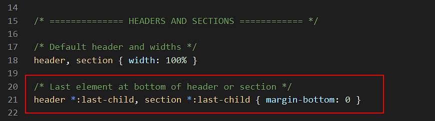
- Save your stylesheet and view your page-11.html web page in your browser. The section blocks and the content inside them should now look as shown below.
The :last-child setting of the new style rule you added means that the style applies only to the final element within the header or a section block in the linked web page
The ‘wildcard’ asterisk * character means that the style rule applies to any final element, regardless of its type. For example, the final element might a text paragraph, an image, icon, button, video or whatever.
Click page-11.html to view a finished sample of this web page in a new tab of your web browser.
✅ You have now completed the first of the three exercises in this Tutorial.
Working with your second sample web page
In this second exercise, you will take advantage of the re-usability of the style-11.css stylesheet to create a new and very different looking web page.
You can achieve this by changing only the background colours and a few font properties in the CSS file.
To begin, follow these steps:
- In VS Code, open the page-11.html and style-11.css files.
- Save the stylesheet with the new name style-12.css.
- Save the web page with the new name page-12.html.
- In the head of page-12.html, update the stylesheet link from style-11.css to style-12.css.
<link rel="stylesheet" href="style-12.css">
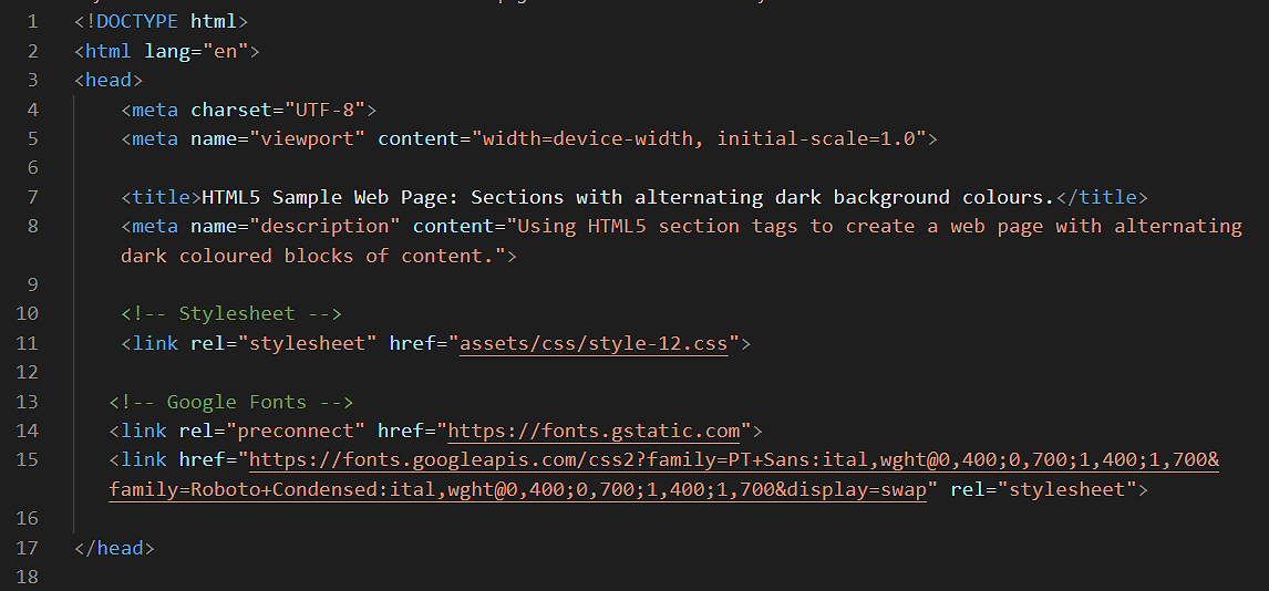
- Also in the head block, copy-and-paste the following to replace the current title and description details:
<title>HTML5 Sample Web Page: Sections with alternating dark background colours.</title>
<meta name="description" content="Using HTML5 section tags to create a web page with alternating dark coloured blocks of content.">
- Save the page-12.html and style-12.css files.
You are now ready to update the font properties in the new web page and stylesheet.
Updating the two font-families (typefaces)
The first font-related task is to replace the two font-families, which are currently Noto Serif and Rubik. Here are the steps:
- In your web browser, go to the Google Fonts website.
- Select the following styles/weights of these two font families.
Roboto Condensed Regular
Roboto Condensed Regular italic
Roboto Condensed Bold 700
Roboto Condensed Bold 700 italic
PT Sans Regular
PT Sans Regular italic
PT Sans Bold 700
PT Sans Bold 700 italic You learnt how to do this in the Working with Google Fonts Tutorial. - Copy the relevant HTML code from Google Fonts and paste it to the head of page-12.html.
The head block should now look as shown below.
- Save your page-12.html web page.
Updating the font-families in CSS
Next, update the font-family style rules in the style-12.css stylesheet.
- Update both the header h1, the header h2 and the section h1 declarations as follows:
font-family: 'Roboto Condensed', sans-serif;
- Next, update the section p declaration as follows:
font-family: 'PT Sans', sans-serif;
- Save your style-12.css stylesheet.
Updating other font-related properties
After changing the font families, make these further font-related updates:
- Update the text colour for the header h1 declaration as follows:
color: #3e414f;
- Update the text colour for the header h2 declaration as follows:
color: #000;
- Update the text colour for the section h1 declaration as follows:
color: #e1f5fe;
- Update the text colour for the section p declaration as follows:
color: #fff;
- Save your style-12.css stylesheet.
Next, let’s update the font letter-spacing and capitalisation.
- For the header h1 declaration, update the letter-spacing as follows:
letter-spacing: 8px;
- For the section h1 declaration, update the letter-spacing as follows:
letter-spacing: 4px;
Also for the section h1 declaration, add this new style rule:font-weight: normal;
- For both the header h1 and the section h1 declarations, add this new style rule:
text-transform: uppercase;
- As a general guideline, whenever a heading is displayed in capital (upper-case) letters, it is a good idea to add a little extra space between the words. This is particularly true when additional spacing has been added between the individual letters of the words.
So, add this new style rule to the header h1 and section h1 declarations:
word-spacing: 102%;
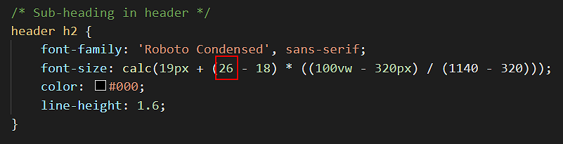
- For the header h2 declaration, increase the upper value of the font-size property in the typographic equation from 22 to 26. See below.
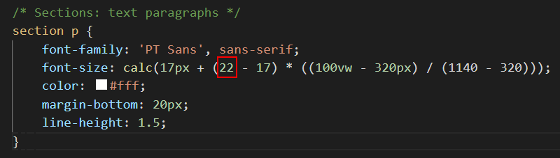
- Finally, for the section p declaration, increase the upper value of the font-size property in the typographic equation from 20 to 22. See below.
- Save your style-12.css stylesheet.
Updating the background colours
The final task is to update the background colours of the web page as set in the stylesheet file.
- Scroll down to near the end of the style-12.css stylesheet and overwrite the current background colour styles by copying-and-pasting the following:
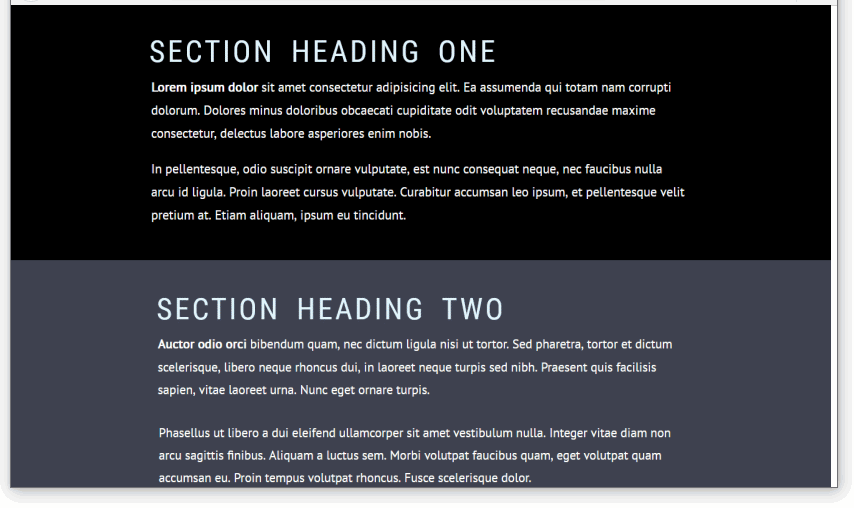
/* Coloured backgrounds */
.bg-header { background-color: #b2e6fe }
.bg-dark-1 { background-color: #000000 }
.bg-dark-2 { background-color: #3e414f }
Note that the class name for the web page header block is the same as before. However, for the section blocks, the two alternating class names are different. - Save and close your style-12.css stylesheet. You are finished updating it.
- Switch to the page-12.html web page and update the class names for the section blocks to match the new class names in the linked stylesheet.
- Rename the bg-pastel-1 class to bg-dark-1, and
- Rename the bg-pastel-2 class to bg-dark-2
- When finished, save your web page. It should now look as shown below.
Click page-12.html to view a finished sample of this web page in a new tab of your web browser.
Working with your third sample web page
In this third exercise, the page-11.html and style-11.css files you worked with earlier will be used to create a new web page and stylesheet. To begin, follow these steps:
- In VS Code, open the page-11.html and style-11.css files you updated in the first exercise in this Tutorial.
- Save the stylesheet with the new name style-13.css.
- Save the web page with the new name page-13.html.
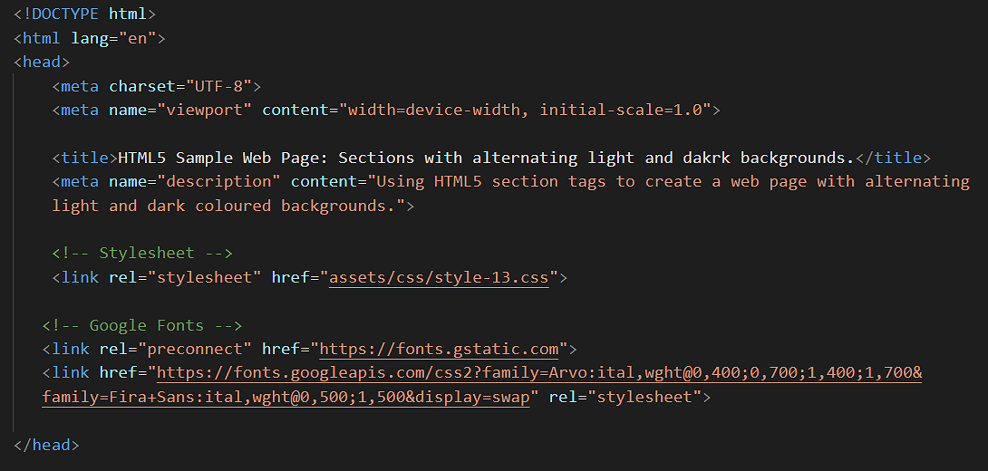
- In the head of page-13.html, update the stylesheet link from style-11.css to style-13.css.
<link rel="stylesheet" href="style-13.css">
- Also in the head block, copy-and-paste the following to replace the current title and description details:
<title>HTML5 Sample Web Page: Sections with alternating light and dakrk backgrounds.</title>
ss<meta name="description" content="Using HTML5 section tags to create a web page with alternating light and dark coloured backgrounds.">
- Save the page-13.html and style-13.css files.
You are now ready to update the font properties in the new web page and stylesheet.
Updating the two font-families (typefaces)
The first font-related task is to replace the two font-families, which are currently Noto Serif and Rubik. Here are the steps:
- In your web browser, go to the Google Fonts website.
- Select the following styles/weights of these two font families.
Fira Sans Regular 400
Fira Sans Regular 400 italic
Fira Sans Medium 500
Fira Sans Medium 500 italic
Arvo Regular 400
Arvo Regular 400 italic
Arvo Bold 700
Arvo Bold 700 italic You learnt how to do this in the Working with Google Fonts Tutorial. - Copy the relevant HTML code from Google Fonts and paste it to the head of page-13.html.
The head block should now look as shown below.
- Save your page-13.html web page.
Updating the font-families in CSS
Next, update the font-family style rules in the style-12.css stylesheet.
- Update both the header h1, the header h2 and the section h1 declarations as follows:
font-family: 'Fira Sans', sans-serif;
- Next, update the section p declaration as follows:
font-family: 'Arvo', serif;
- Save your style-13.css stylesheet.
Next, let’s update some other font-related properties.
- For both the header h1 and section h1 declarations, update the color values to the following:
color: #1435b3;
- For both the header h1 and section h1 declarations, update the letter-spacing values from -1px as follows:
letter-spacing: 8px;
- For the header h1, header h2 and section h1 declarations, add this new style rule:
font-weight: 500;
- For the section p declaration, increase the upper value of the font-size property in the typographic equation from 20 to 21. Also, update the line-height to 1.7. See below.
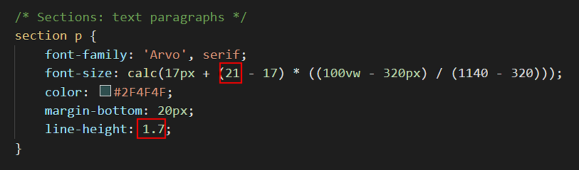
- Save your style-13.css stylesheet.
Updating the background colours
Next, update the background colours of the web page as set in the stylesheet file.
- Scroll down to near the end of the style-13.css stylesheet and overwrite the current background colour styles by copying-and-pasting the following:
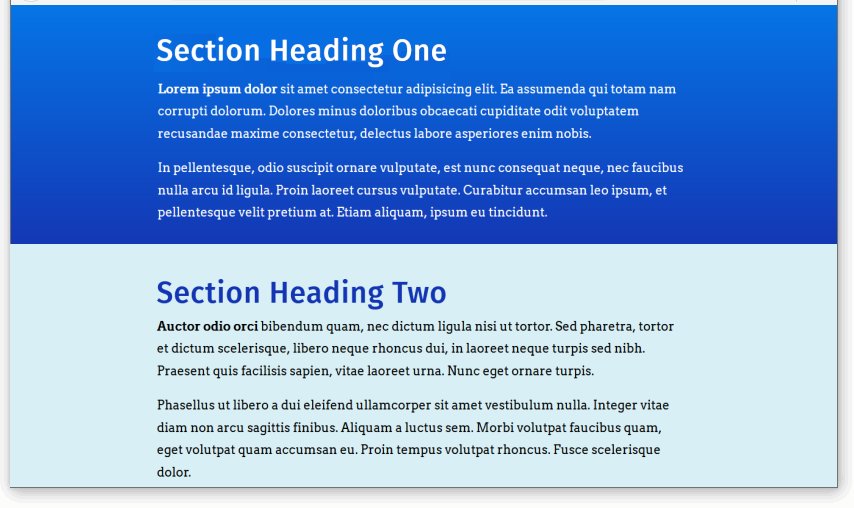
/* Coloured backgrounds */
.bg-header { background-color: #f5f9fb }
.bg-blue-light { background-color: #d8f0f5 }
.bg-blue-dark { background-color: #1435b3 }
Note that the class name and colour value for the web page header block is the same as before. However, for the section blocks, the two alternating class names and colour values are different. - Save and close your style-13.css stylesheet. You have finished updating it.
- Switch to the page-13.html web page and update the class names for the section blocks to match the new class names in the linked stylesheet.
- Rename the bg-pastel-1 class to bg-blue-dark, and
- Rename the bg-pastel-2 class to bg-blue-light
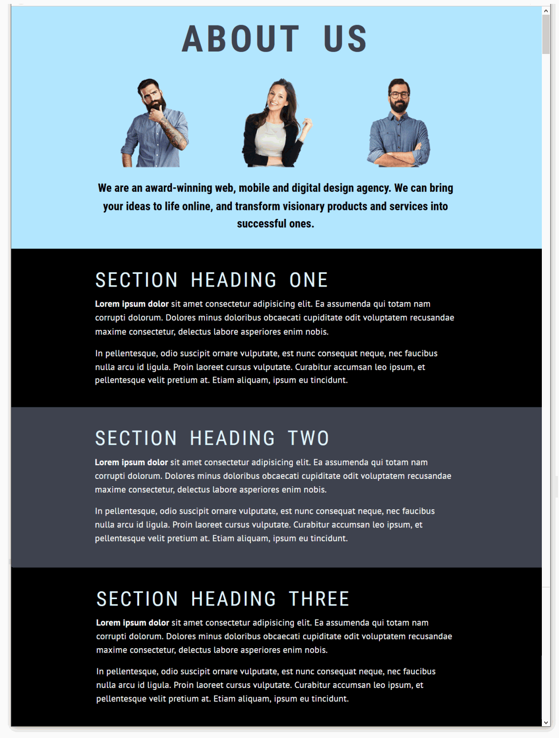
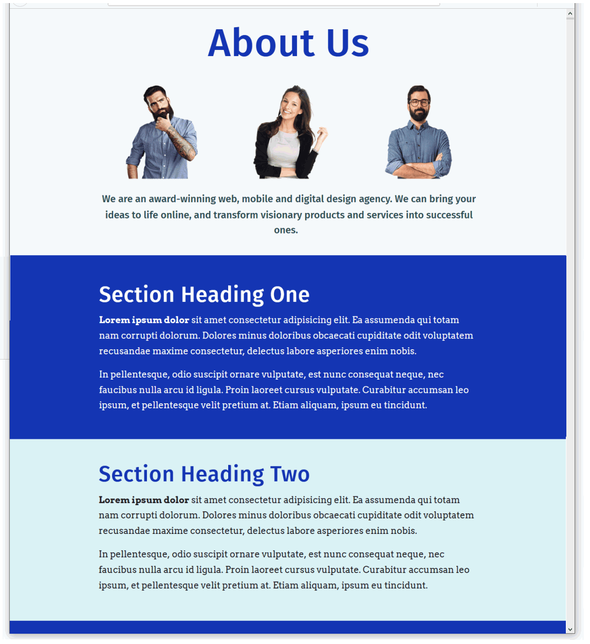
- When finished, save your web page. It should now look as shown below.
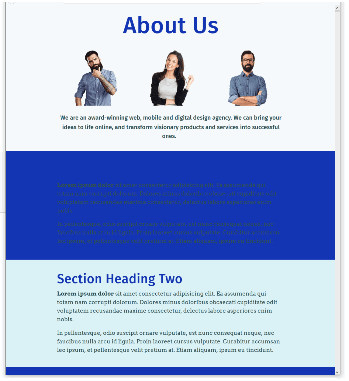
Alternating font colours between container blocks
We still have some more work to do with this third sample web page and stylesheet.
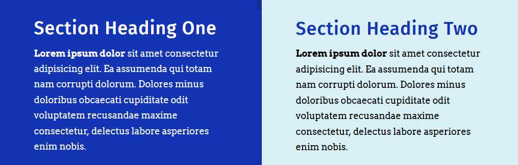
- For the section blocks with a dark blue background, both the headings and text paragraphs should display in a light blue colour.
- For the section blocks with a light blue background, the headings should display in a dark blue, and the text paragraphs in a dark colour closer to black.
Follow these steps:
- In the style-13.css stylesheet, add the following new lines near the bottom of the file, just after the current background colours.
/* Light blue section background: h1 headings and p text paragraphs */
.bg-blue-light h1 { color: #1435b3 }
.bg-blue-light p  { color: #222 }

/* Dark blue section background: h1 headings and p text paragraphs */
.bg-blue-dark h1 { color: #fff }
.bg-blue-dark p  { color: #fff }
See below.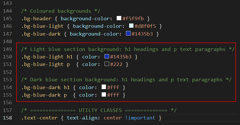
- When finished, save your style-13.css stylesheet and view the page-13.html web page in your browser. It should now look as shown below.
Using a linear colour gradient as a background
In all three sample web pages above you have applied what are called solid background colours to the section blocks, using the background-color style property.
CSS also offers a property called background-image that enables you to apply linear gradients to <div> blocks and other web page elements.
Linear-gradients are of two main types:
- Gradients of the same colour. For example, from a light blue to a dark blue.
- Gradients of different colours. For example, from blue to green.
Let’s apply a linear gradient background to our third sample web page.
- In VS Code, open your style-13.css stylesheet.
- Near the bottom of the file, you can see the following selector and style rule.
.bg-blue-dark { background-color: #1435b3 }
- Replace this by copying-and-pasting the following.
/* Default gradient direction: top to bottom */
.bg-blue-dark { background-image: linear-gradient(#0575e6, #1435b3) }
See below.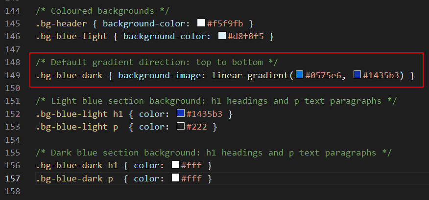
- Save your stylesheet and view the page-13.html web page in your browser.
You can see that the dark blue background subtly changes from lighter to darker, in the direction from top to bottom.
- You can change the default (top-to-bottom) direction of a linear gradient by adding a direction setting within the property value.
For example, linear gradients more commonly change from left to right.
Under the linear gradient you added earlier, copy-and-paste this new left-to-right gradient. It has the same two colours. But because of the extra 90deg setting, the direction is different.
/* Gradient direction: left to right */
.bg-blue-dark { background-image: linear-gradient(90deg, #0575e6, #1435b3) }
- Save your stylesheet and view your page-13.html web page in your browser. You can see that the dark blue background changes from left to right.
Click page-13.html to view a finished sample of this web page in a new tab of your web browser.
✅ All done. You have now finished this third sample exercise.
Here are some more examples of linear gradients for you to experiment with in your web pages.
   /* Green */
    background-image: linear-gradient(90deg,#02727e,#06b294);
   /* Bronze */
    background-image: linear-gradient(90deg,#6b2d38,#cd6065);
   /* Purple to orange - modern */
    background-image: linear-gradient(90deg,#e052a0,#f15c42);
   /* Purple (AIB Bank) */
    background-image: linear-gradient(90deg,#802b7b,#de0a85);
   /* Blue (Disney Channel ad) */
    background-image: linear-gradient(90deg,#07092f,#165cc0);
   /* Yellow to blue - tangy! */
    background-image: linear-gradient(90deg,#b8ea0a,#50c8f7);
Updating your website home page
Now that you have created and styled three new web pages, let’s add hyperlinks to them on the ‘home page’ of your web site. Follow the steps below:
- In VS Code, open this HTML file in your ‘main’ websites folder: index.html
- Copy-and-paste the following new lines to your web page, to just after the link to page-10.html.
<p><a href="exercises/page-11.html">Web Page with Pastel Sections</a></p>
<p><a href="exercises/page-12.html">Web Page with Dark Sections</a></p>
<p><a href="exercises/page-13.html">Web Page with Alternating Sections</a></p>
Save your index.html web page and view the result in your browser.
Here are some websites that will generate the code for colour gradient backgounds:
Uploading your files to GitHub
After finishing your web page and stylesheet, you are now ready to upload them to your account on GitHub.
- Open a new tab in your web browser and go to GitHub.com. If you are not already signed in to your GitHub account, sign in now.

- On your GitHub home page, click the ‘repo’ that holds your web pages. Its name will look as follows, where username is your chosen username on GitHub.
username.github.io

- On the next GitHub screen displayed, near the right of the screen, you can see a button named Add file. Click on it.

- From the dropdown list displayed, choose the option Upload files.

- In File Explorer (Windows 10) or Finder (Apple Mac), drag-and-drop your index.html file and your 📁 exercises sub-folder to upload them to your repository on GitHub.

- Scroll down to the bottom of the GitHub screen, and accept or edit the short message (Add files via upload) in the Commit changes box.
- Finally, click the green Commit changes button to upload your files.

Your updated home page and three sample pages are now published on GitHub at web addresses similar to the following:
https://username.github.io/index.html
https://username.github.io/exercises/page-11.html
https://username.github.io/exercises/page-12.html
https://username.github.io/exercises/page-13.html
It may take a few minutes for your uploaded files to appear on GitHub.