Learning Goals
At the end of this Tutorial, you will be able to:
- Explain the difference between hosted (CDN) Tailwind and a local build pipeline.
- Add Tailwind to any HTML page with a single <script> and use utility classes safely.
- Configure Tailwind in the browser for colours, fonts, and spacing scales.
- Build a responsive hero and card grid with dark mode support.
About TailwindCSS
TailwindCSS is a utility-first CSS framework. Instead of writing your own stylesheet file such as mystyle.css, you import utility classes directly in your HTML from the pre-built TailwindCSS stylesheet.
You get consistency, speed, and responsive/dark mode variants out of the box.
You can use TailwindCSS in either of two ways:
- Hosted (CDN): Add <script src="https://cdn.tailwindcss.com"> to your page; Tailwind is available immediately. Great for learning, prototypes, and simple static pages.
- Build pipeline (Node/PostCSS): Scans your UI elements, tree-shakes unused classes, supports plugins, and produces tiny production CSS. Best for large projects.
In this Tutorial, we will use the hosted (CDN) approach to get productive instantly — no tooling required.
Creating a workfile
Begin by creating a sample HTML file to expermiment with.
- Create a new folder named tw in your exercises folder.
- In VS Code, create a new HTML file and save it as tw-1.html.
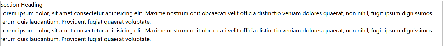
- In this file, add a <h2> heading and two paragraphs of lorem ipsum placeholder text.
- Wrap the content inside a <section> tag.
- Display your new HTML file in a web browser.
Your web page should now look like this:
Working with layout in web design
In web design, you control UI layout with margins and padding. See below.
 |
 |
MARGINS |
PADDING |
In the <head> of your workfile, copy-and-paste the following:
<style>
/* Padding: inner space for the container */
section { padding: 32px 20%; } /* 32px top and bottom, 20% left and right */
/* Margins: vertical gaps between siblings */
section h2 { margin-bottom: 6px; } /* 6px below the heading */
section p { margin-bottom: 16px; } /* 16px below each paragraph */
</style>Your web page should now look like that below.
Adding Tailwind via CDN
Now let's use TailwindCSS to add padding and margins.
- Remove the above CSS style values from your tw-1.html workfile.
- Copy-and-paste your HTML workfile into an AI and ask:
How do I add hosted TailwindCSS to this HTML file. Do not add any utility classes to this file. - Follow the AI instructions and replace everything in your HTML workfile with the AI response.
When you save your workfile, it should look unstyled again.
Note that:
- Even the default web browser styles have been removed.
- The font now defaults to sans-serif instead of serif.
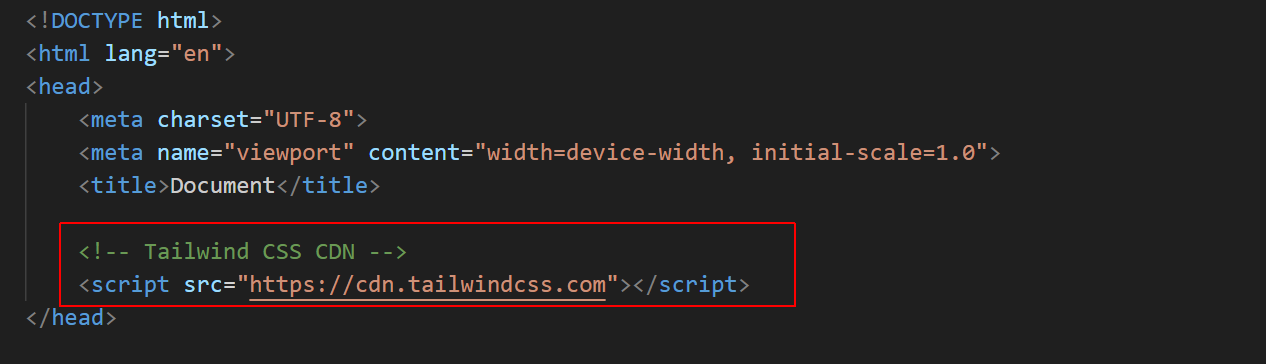
In VS Code, you can see that the <head> of your workfile should now include the Tailwind CSS CDN link.
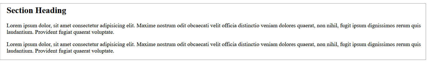
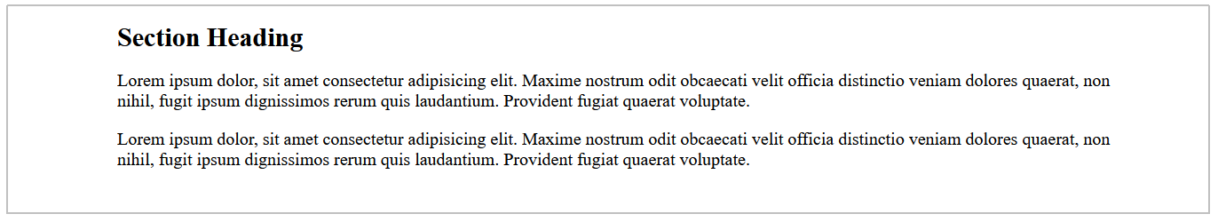
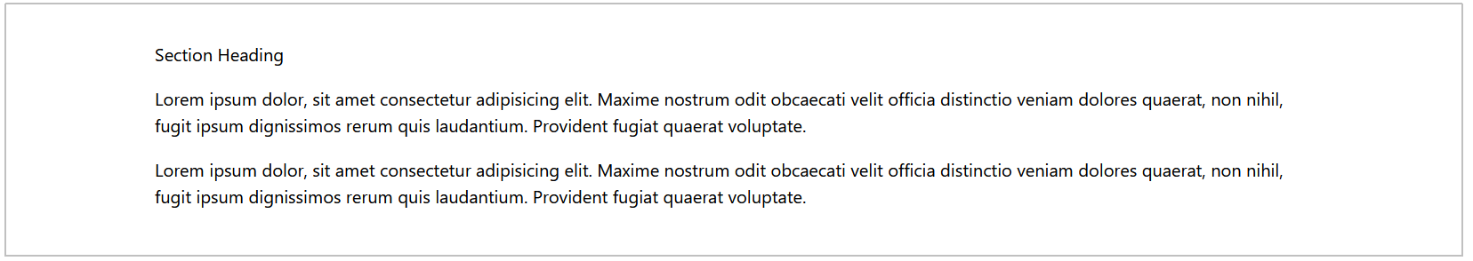
Now, replace the <body> of your tw-1.html workfile with the following:
<!-- Same structure, but spacing is expressed with utilities -->
<section class="px-24 py-10"> <!-- padding left/right: 24. padding top/bottom: 10 -->
<h2 class="mb-4">Section Heading</h2> <!-- margin-bottom: 16px -->
<p class="mb-4">Lorem ipsum dolor, sit amet consectetur adipisicing elit. Maxime nostrum odit obcaecati velit officia distinctio veniam dolores quaerat, non nihil, fugit ipsum dignissimos rerum quis laudantium. Provident fugiat quaerat voluptate.</p>
<p>Lorem ipsum dolor, sit amet consectetur adipisicing elit. Maxime nostrum odit obcaecati velit officia distinctio veniam dolores quaerat, non nihil, fugit ipsum dignissimos rerum quis laudantium. Provident fugiat quaerat voluptate.</p>
</section>
When you save your work file, it should look as shown below in a web browser.
See the links below for the official docs from TailwindCSS:
Sample AI prompts
For each prompt, copy the output HTML into a new file in your 📁 exercises folder, save, and open in your browser.
** Web Page Structure **


Create the HTML for a web page that is linked to the hosted CDN TailwindCSS stylesheet.


In the <head>, include the UTF-8 charset, a <title>, a meta description and the responsive viewport meta tag.


For the <title>, add the words "Between 50 and 60 characters (including spaces)"


For the meta description, add the words "Between 150 and 160 characters (including spaces). Like the title, this is important for search engines"


Apply TailwindCSS markup to all elements as specified below.


** Web Page Content **


In the <body>, create [3] blocks of content. Each content block should be inside a <section> tag.


Each block of content should contains one <h2> sub-heading tag and [2] paragraphs of text with the <p> tag.


Each <h2> sub-heading should the words "Section sub-heading"


Each <p> text paragraph should contain [60] words of placeholder lorem ipsum text.


Add a placeholder image under each <h2> tag from the https://placehold.co/ website.


Apply a different [light] background color for each section. The section's background color should fill the enture with of the viewport.


** Responsive Padding Spacing inside <section> content containers ***


For the <section> tag, the vertical padding should be:


* Default: 8 pt and 10 pb units


* Viewports => 768px: 10 pt units and 12 pb units


* Viewports => 1024px: 12 pt units and 14 pb units


* Viewports => 1280px: 14 pt units and 16 pb units


Also for the <section> tag, the horizontal padding should be:


* Default: 6 px units


* Viewports => 768px: 28 px units


* Viewports => 1024px: 48 px units


* Viewports => 1280px: 72 px units


** Responsive Margin Spacing under <h2> and <p> block-level tags ***


For the <h2> tag, the bottom margin should be:


* Default: 4 mb units


* Viewports => 1024px: 6 mb units


* Viewports => 1280px: 8 mb units


For the <p> tag, the bottom margin should be:


* Default: 6 mb units


* Viewports => 1024px: 8 mb units


Apply the same mb values under the <img> tag in each <section>.


For the final <p> tag in each <section>, set the bottom margin to zero.


** Typography: <h2> **


Apply a color of [black]


Apply a font-family of [font-sans]


Apply a font weight of [semibold]


Apply a tracking value of [tighter]


Apply these responsive text sizes:


* Default: text-4xl


* Viewports >= 768px: text-5xl


* Viewports >= 1024px: text-6xl


* Viewports >= 1280px: text-7xl


Apply these line-spacing values:


* Default: leading-tight


* Viewports >= 768px: leading-snug


* Viewports >= 1024px: leading-none


* Viewports >= 1280px: leading-none


** Typography: <p> **


Apply a text color of [gray-800].


Apply a font-family of [font-serif].


Apply a font weight of [normal].


Apply a line-height of [leading-relaxed].


Apply these responsive text sizes:


* Default: text-lg


* Viewports >= 1024px: text-2xl


Apply these responsive values for inter-line spacing:


Default: leading-relaxed


Viewport => 1024px: lg:leading-loose


Viewport => 1280px: xl:leading-10


** Hyperlinks **


Inside each <p> tag of every section, add a hyperlink with a destination of #.


Style the hyperlink so that:


* The link text is not bold


* The link text is underlined


* The link text color is blue-600


* The link underline is blue-600


* The link underline thickness is decoration-2


* The link underline offset is underline-offset-4


* The link text becomes red-800 when hovered over


* The link text underline is removed when hovered over


Do not add any other TailwindCSS classes.


[Do include comments in the HTML code to indicate which TailwindCSS classes are being applied to each element.]


To make your output easier to read, add an empty line after each closing HTML tag.
Create an event landing page for a tech meetup using Tailwind via CDN.


Include a sticky header nav, a hero with a CTA button, a schedule section (two-column on md+), and a speaker card grid. Add hover and focus states on links and buttons. Provide a simple footer with social links.
Build a documentation-style layout using Tailwind via CDN.


Left sidebar with section links on lg+ and a single-column stacked layout on mobile. Main content uses readable line-length (max-w-prose) and headings with spacing. Add a top “Edit on GitHub” button styled as a Tailwind utility-based component.