Learning Goals
At the end of this Tutorial, you will be able to:
- Build modern forms with different input types (text, email, password, number).
- Understand the special properties and behaviours of each input type.
- Intercept form submissions using e.preventDefault().
- Extract and validate user data using .value and .trim().
- Provide real-time validation using blur and input events.
- Create field-specific validation rules for different input types.
For this Tutorial, in your exercises folder, create a new web page named forms-intro.html.
Create a new empty text file named forms-intro.js and save it in this same folder.
Add a link to forms-intro.js in the <head> of your forms-intro.html web page using a <script> tag with the defer attribute.
Introduction to forms
Forms are the primary way web applications collect data from users. Before writing JavaScript, it is important to understand how to structure your HTML.
Layout conventions
There are two main conventions for placing text labels next to input fields:
 Labels to the Left: Often used on wide desktop screens.
 |
 Labels Above: The modern standard for mobile responsiveness, as it prevents horizontal scrolling on small screens.
 |
In your forms-intro.html, add the following CSS styles in the <head> of the file.
<style>
body {
font-family: Arial, sans-serif;
background-color: #f0f2f5;
margin: 0;
padding: 0;
}
h1 {
text-align: center;
margin-top: 40px;
color: #333;
}
/* Form container */
.label-above {
max-width: 480px;
margin: 40px auto;
padding: 32px;
background-color: #f9f9f9;
border: 1px solid #ddd;
border-radius: 8px;
}
/* Each label/input pair */
.form-group {
display: flex;
flex-direction: column;
margin-bottom: 20px;
}
/* Labels above their fields */
.form-group label {
font-weight: bold;
margin-bottom: 6px;
color: #333;
}
/* Input fields */
.form-group input {
padding: 10px 12px;
font-size: 1rem;
border: 1px solid #ccc;
border-radius: 5px;
outline: none;
transition: border-color 0.2s ease;
}
.form-group input:focus {
border-color: #007BFF;
}
/* Error messages — hidden by default */
.error-text {
margin-top: 6px;
font-size: 0.875rem;
color: #dc3545;
display: none;
}
/* Submit button */
button[type="submit"] {
display: block;
width: 100%;
padding: 12px;
font-size: 1rem;
font-weight: bold;
color: #fff;
background-color: #007BFF;
border: none;
border-radius: 5px;
cursor: pointer;
transition: background-color 0.2s ease;
}
button[type="submit"]:hover {
background-color: #0056b3;
}
</style>This CSS will give you a clean, modern form layout with labels above the input fields, clear error messages (not displayed by default), and a styled Submit button. You can customise the colours and spacing as needed.
Building a simple form
Let's start with the most basic form imaginable: collecting a person's first and last name. This introduces the fundamental pattern you'll use for all forms.
Add the HTML for this form to the <body> of your forms-intro.html web page:
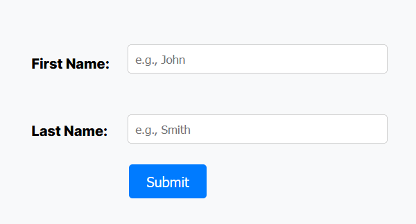
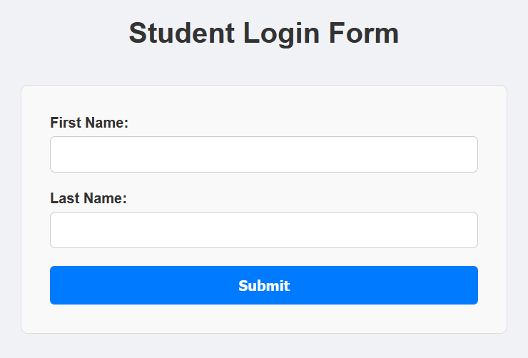
<h1>Student Sign-in Form</h1>
<form id="myBigForm" class="label-above">
<div class="form-group">
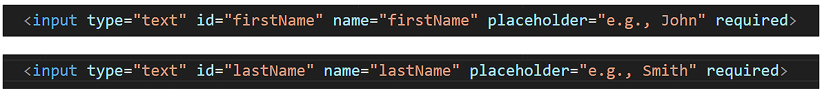
<label for="firstName">First Name:</label>
<input type="text" id="firstName" name="firstName" placeholder="e.g., John" required>
<span id="firstNameError" class="error-text">First name is required.</span>
</div>
<div class="form-group">
<label for="lastName">Last Name:</label>
<input type="text" id="lastName" name="lastName" placeholder="e.g., Smith" required>
<span id="lastNameError" class="error-text">Last name is required.</span>
</div>
<button type="submit">Submit</button>
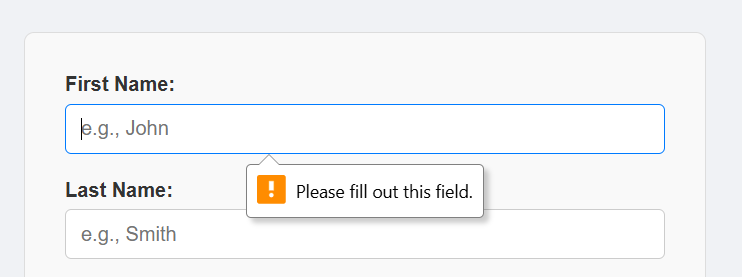
</form>In your web browser, your form should look like that below.
Note the following points about your basic form:
- The entire form, including the Submit button, is wrapped inside the <form> element, which has a unique id. This makes it easier for JavaScript to handle the form submission.
- All three elements associated with each form field - the label, the input, and the error message - are wrapped together inside a <div class="form-group"> tag. This simplifies styling and layout.
- The for attribute on a <label> must exactly match the id of its associated input field. This is a significant usability feature, as clicking anywhere on the label text moves focus directly to the associated input field.
- Each field has both an id and a name attribute. The id is used by HTML and JavaScript on the client side. The name is used by the server when the form data is submitted.
- The <input type="text"> field is the simplest form field. It is used for single-line text input. Anything you enter into this field - including numbers - is treated as plain-text.
If you click the Submit button now, the web page will reload from cache.
The placeholder and required input field attributes
You can add two further attributes to each of the input text fields.
- placeholder: This lets you insert some sample text inside the input field, which disappears when the user starts typing.
- required: This makes the field mandatory. The web browser will prevent form submission if the field is empty.
Update the two input fields as shown below, and test the form again.
You should see the placeholder text inside each field, and if you try to submit the form with either field empty, the browser will show a warning and prevent submission.
The submit event and default behaviour
By default, when a user clicks a Submit button, the browser attempts to:
- Send the data to a server, and
- Reload the web page.
In modern JavaScript applications, we usually want to first validate form input on the client side. We do this using the event object's .preventDefault() method.
Paste the following JavaScript into your forms-intro.js file:
// Get the form from the HTML using its unique ID
const formStudentReg = document.getElementById("myBigForm");
// Handle the submit event of the form
formStudentReg.addEventListener("submit", e => {
// Prevent data from being sent to a server and page from reloading
e.preventDefault();
// Get the input values after 'cleaning' them
const firstName = document.getElementById("firstName").value.trim();
const lastName = document.getElementById("lastName").value.trim();
// Set up Boolean for simple validation
let isValid = true;
// Test input values and show/hide error messages
if (firstName === "") {
document.getElementById("firstNameError").style.display = "block";
isValid = false;
} else {
document.getElementById("firstNameError").style.display = "none";
}
if (lastName === "") {
document.getElementById("lastNameError").style.display = "block";
isValid = false;
} else {
document.getElementById("lastNameError").style.display = "none";
}
// If valid, process the data
if (isValid) {
console.log(`Welcome, ${firstName} ${lastName}!`);
formStudentReg.reset(); // Clears all fields
}
});Note: You must declare the form variable (formStudentReg) before attaching the event listener. Because you can't attach an event listener to a variable that doesn't exist yet.
Extracting values and validation
To get the text a user typed into an input, JavaScript reads its .value property. We also use the .trim() string method to remove any accidental blank spaces at the start or end of their text.
Because you attached the listener to the submit event of the form (rather than just the click event of the button), HTML automatically handles keyboard accessibility. If the user presses the Enter key while typing in any text box, it will trigger this exact same event!
Enter some text in the two text fields, press Submit, and verify the form works correctly.
Adding a type="email" field
Now, let's enhance our form by adding an email field. Paste this HTML into your form after the first two fields.
<div class="form-group">
<label for="email">Email:</label>
<input type="email" id="email" name="email" placeholder="e.g., [email protected]" required>
<span id="emailError" class="error-text">Please enter a valid email address.</span>
</div>Setting an input field type to email rather than text provides two benefits:
- Mobile UX: On smartphones, it automatically opens an email-optimised keyboard showing the
@and.comkeys. - Built-in validation: The browser will automatically pause the form submission and warn the user if they forget the
@symbol!
Email validation
The browser's built-in email check catches missing @ symbols, but it won't catch things like user@ or @domain.com. A simple regex covers the common cases without getting overly complex:
function validateEmail(email) {
const emailPattern = /^[^\s@]+@[^\s@]+\.[^\s@]+$/;
return emailPattern.test(email);
}To use this function, simply call it with the trimmed email value from your form. It will return true if the email is valid and false if it is not.
if (!validateEmail(document.getElementById("email").value.trim())) {
document.getElementById("emailError").style.display = "block";
isValid = false;
} else {
document.getElementById("emailError").style.display = "none";
}Now, if you try to submit the form with an invalid email format, you'll see your custom error message instead of the browser's default warning.
Adding a type="password" field
Input fields with type="password" hide the user's input with dots or asterisks. They also disable browser autofill suggestions for security.
Paste the following password field into your form:
<div class="form-group">
<label for="password">Password:</label>
<input type="password" id="password" name="password" placeholder="Enter your password" required>
<span id="passwordError" class="error-text">Password must be at least 8 characters.</span>
</div>Password validation
Add a simple password validation function that checks only that the entered and trimmed password has a minimum length.
function validatePassword(password) {
return password.length >= 8;
}Update your submit event listener with the following:
// Validate password meets minimum requirements
if (!validatePassword(document.getElementById("password").value.trim())) {
document.getElementById("passwordError").style.display = "block";
isValid = false;
} else {
document.getElementById("passwordError").style.display = "none";
}Adding a type="number" field
For fields that require numbers (like Student ID, age, or quantity), use type="number". Paste the HTML below into forms-intro.html.
<div class="form-group">
<label for="studentId">Student ID:</label>
<input type="number" id="studentId" name="studentId" placeholder="5-digit ID (10000-99999)" required>
<span id="studentIdError" class="error-text">ID must be in range 10000-99999</span>
</div>The type="number" input provides special attributes and behaviour:
- Automatic validation: Non-numeric characters display an error
- Browser controls: Shows up/down arrows for incrementing
Numeric validation
Paste the following code inside your submit event listener, after the password validation block.
const studentId = document.getElementById("studentId").value.trim();
if (studentId < 10000 || studentId > 99999) {
document.getElementById("studentIdError").style.display = "block";
isValid = false;
} else {
document.getElementById("studentIdError").style.display = "none";
}Experiment by entering various inputs to your form and verify it works correctly.
Real-time feedback: blur and input
Waiting until the user clicks Submit to show them an error can be frustrating. Modern websites provide immediate feedback as you navigate the form using key events:
- blur: This event fires the exact moment the user clicks or tabs away from an input field.
- input: This event fires instantly on every keystroke.
Use blur on the email field
The email field is the best choice because format validation only makes sense once the user has finished typing an address. Checking on every keystroke would flag the input as invalid before they've even had a chance to finish it!
Paste in this new event listener into forms-intro.js
/* BLUR: Listener to check email format after user clicks away */
document.getElementById("email").addEventListener("blur", () => {
if (!validateEmail(document.getElementById("email").value.trim())) {
document.getElementById("emailError").style.display = "block";
} else {
document.getElementById("emailError").style.display = "none";
}
});Use input on the Student ID field
The number field is ideal for the input event because the range check is instant and unambiguous — as soon as the number is outside 10000-99999, you know. It also gives you a satisfying, visible demonstration of live feedback.
Paste in this new event listener into forms-intro.js.
// INPUT: Checks user's input on every keystroke and provides instant feedback
document.getElementById("studentId").addEventListener("input", () => {
const studentId = document.getElementById("studentId").value.trim();
if (studentId < 10000 || studentId > 99999) {
document.getElementById("studentIdError").style.display = "block";
} else {
document.getElementById("studentIdError").style.display = "none";
}
});Note that the blur and input real-time listeners work alongside the submit listener — they're not a replacement. They are purely a UX improvement.
The submit listener remains the definitive gatekeeper for form validation.
All inputs should then be validated after form submission on the server side. This ensures that even if JavaScript is disabled or bypassed/hacked, your system's data integrity is maintained.
Keyboard events and shortcuts
While the Enter key is handled automatically by the form submit event listener, you can use the keydown event to listen for other specific keys to improve the user experience.
For example, you can allow the user to clear the form by pressing the Escape key or submit the form with Ctrl+Enter (or Cmd+Enter on Mac).
// Listen for keystrokes anywhere on the page
document.addEventListener("keydown", e => {
// Check which key was pressed and if Ctrl/Cmd is held
if (e.key === "Escape") {
// Clear all forms on Escape
document.querySelectorAll("form").forEach(form => form.reset());
console.log("All fields cleared via Escape key.");
}
// Ctrl+Enter to submit (useful for long forms)
if (e.key === "Enter" && (e.ctrlKey || e.metaKey)) {
const activeForm = document.querySelector("form:focus-within");
if (activeForm) {
activeForm.dispatchEvent(new Event("submit", { bubbles: true, cancelable: true }));
}
}
});Try it yourself
Style the error states
Rather than just showing the error message span, also add a CSS class (e.g. .input-error) to the input field itself when validation fails, turning its border red. Remove the class when it passes. This bridges JavaScript and CSS in a way that mirrors professional practice.
---
The Password Length Checker
Add a Password input (type="password") to your form. Attach an input event listener to it. As the user types, check the length of .value. If it is less than 8 characters, make the input border red. If it is 8 or more, make the border green.
---
A challenge task
Disable the Submit button on page load, and only enable it once all fields pass validation. This requires you to think about combining everything you've learned and introduces button.disabled as a concept.
More learning resources
Tutorial Quiz
Tutorial Podcast
Sample AI prompts
What are the advantages and disadvantages of client-side form validation compared to server-side validation?Explain how e.preventDefault() works in JavaScript. What other situations is it useful beyond form submission?What is the difference between the blur and input events in JavaScript? When would I use each one?Explain the difference between the keydown and keyup events in JavaScript, and when you would use each one.Show me how to make a form more accessible for screen readers using ARIA labels and roles.